Before I begin
As I am still a beginner painter I am very aware of the lack of skill and instruction I have had as a painter. I generally see ideas that I like or think of a subject that interests me and then I jump into creating it. Of course I have done some short courses, watch videos and read books, but my practical exposure is generally all over the place. This also stems from having a lack of time, as I am also working full time. I wanted to approach the work differently this time, as one of the notes my tutor gave is to rather focus on the techniques, artists or subject matter that interest me, instead of trying to pursue them all.
Though the textual research part of the course is useful in learning the history and context of art and being introduces to a wide array of artists and styles, and can make it particularly difficult to focus on, as you find yourself thinking that you want to try it all. Therefore before beginning my practical work I decided to really reflect on the paintings I have enjoyed creating and that have evidence of success. After looking through my work in Painting 1 I realized that I have two subject areas that stand out to me; urban scapes and the figure. But now that I have a focus on a particular subject I also need think about developing my own style. Up till now I have been working with several different techniques and mediums which means I haven't really been able to consider which may be a strength. I know that I like working with oils and watercolours, but both these mediums have a wide array of application techniques. I figured the only way to truly get to a technique that speaks to me, I would need to compare how different methods in the same medium could create different impressions of the same subject matter. Hopefully this will help me hone into developing my own style.
Though the textual research part of the course is useful in learning the history and context of art and being introduces to a wide array of artists and styles, and can make it particularly difficult to focus on, as you find yourself thinking that you want to try it all. Therefore before beginning my practical work I decided to really reflect on the paintings I have enjoyed creating and that have evidence of success. After looking through my work in Painting 1 I realized that I have two subject areas that stand out to me; urban scapes and the figure. But now that I have a focus on a particular subject I also need think about developing my own style. Up till now I have been working with several different techniques and mediums which means I haven't really been able to consider which may be a strength. I know that I like working with oils and watercolours, but both these mediums have a wide array of application techniques. I figured the only way to truly get to a technique that speaks to me, I would need to compare how different methods in the same medium could create different impressions of the same subject matter. Hopefully this will help me hone into developing my own style.
Life-drawing Class
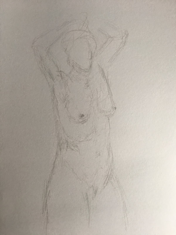
As I enjoy painting the figure I thought it would be good to go to a life-drawing class to give myself additional practice in examining the figure. The model does 8 short 5min poses and then one long 25min pose.
5 minute poses

1
|

2
|

3
|
4
|

5
|

6
|

7
|

8
|
Reflection
I find the 5 minute poses incredibly challenging, as I have difficulty working that fast. It takes me while to examine the proportions and features in relation to each other. In some I decided to just focus on the face or just on the body as it is difficult for me to get the details of both. One thing I notice in the fast studies, is that the studies that focus on the body only, often has a head that is too small. I suppose the idea behind these fast poses are potentially to allow for a more loose interpretation that is not necessarily dependent on perfection. Of the studies above, I think 2,3 and 8 are more successful, as the poses are most engaging (in my opinion) and the proportions are more accurate.
I find the 5 minute poses incredibly challenging, as I have difficulty working that fast. It takes me while to examine the proportions and features in relation to each other. In some I decided to just focus on the face or just on the body as it is difficult for me to get the details of both. One thing I notice in the fast studies, is that the studies that focus on the body only, often has a head that is too small. I suppose the idea behind these fast poses are potentially to allow for a more loose interpretation that is not necessarily dependent on perfection. Of the studies above, I think 2,3 and 8 are more successful, as the poses are most engaging (in my opinion) and the proportions are more accurate.
25 minute pose
|
As I had a bit more time to think with for this pose, I first created some grid lines to represent the space where the model was and to help me place body parts in a specific area. In previous drawing courses I had learned to use the head to help measure other parts of the body, though this can be challenging if they are in a different position, though I did use my pencil to compare the lengths of certain area of the body to another. |

|
Reflection
Having the additional time did give me a chance to delve a bit more into the three dimensional aspect of the figure, though I still did not have enough time to complete the sketch. I suppose some would say that it is important to block out all areas of the figure, before you start shading and creating details, but that is not the approach I took. In general I think that I should allow myself to be more spontaneous and not always worrying in achieving perfect form or proportion. Many artists like El Greco, Picasso and Matisse have proven that distortion can be a wonderful thing. And as I don't think realism is my strength, I rather want to try to be more considerate of how the marks I make can be emotive and expressive.
Having the additional time did give me a chance to delve a bit more into the three dimensional aspect of the figure, though I still did not have enough time to complete the sketch. I suppose some would say that it is important to block out all areas of the figure, before you start shading and creating details, but that is not the approach I took. In general I think that I should allow myself to be more spontaneous and not always worrying in achieving perfect form or proportion. Many artists like El Greco, Picasso and Matisse have proven that distortion can be a wonderful thing. And as I don't think realism is my strength, I rather want to try to be more considerate of how the marks I make can be emotive and expressive.
Gallery Visits
I try to visit galleries or shows as often as I can as you can find a lot of inspiration from looking at the works of others. As I am also trying to be more attentive of how the marks made on campus can add to the emotion of a piece, it is useful to see these markings up close. I attended a gallery walk arranged by an organization in Hong Kong called Accidental Art. On our walk we visited 3 galleries where we were given the opportunity to look at the pieces and then would gather to have discussion about the work, the artists and techniques.
Gallery 1: Fringe Club
Here was an exhibition of a local artist Wu Chun Yin Aries titles DomestiCity. The artist likes to observe that which is around him and makes up his every day life. As such, the paintings are all recordings of his home and the things that surround him daily. There were many paintings of the surroundings in his room as well as several different perspectives of items in the bathroom.

Bathroom 1, Wu Chun Yin Aries, 2015
|

Plan, Dry Lemon and Plastic Duck, Wu Chun Yin Aries, 2015
|
|
This artist represents the world around him with great accuracy, while also taking what would be a boring and mundane subject and making it soulful. I believe he achieve this by finding a fine balance in how he blends colours. Living in Hong Kong myself, I am fully aware of how clinical, cramped and old some of the apartments here can feel. There is not a great emphasis on aesthetics in most local homes here. All rooms are often just covered in white washed walls and tiles which tend to discolour over time. It is this 'white' canvas that the artist has managed to transform. He has truly considered the subtle changes in white as reflects the environment around it, invigorating what would be a plain blank surface. The artist also has an eye for detail, considering how small objects can be relatable to the viewer, like the arrangement of cleaning and bath products on the toilet. Many Hong Kong dwellers will know full well that space is always an issue here. In other paintings, which I haven't posted here, you can also recognize IKEA furniture, another staple of the Hong Kong apartment. This not only speaks to the audience of a subject matter they know, but also ads a whimsical element. Another aspect I found interesting about his work is how he sometimes just leaves a section of the canvas unfinished (not pictured). The lines are blocked out with colours or shapes, but not completed. This may be because certain areas or objects carry a greater significance to the artist. |

Close up detail of how various subtle variations are used to represent white.
|
What can I take away from this work?
The artist's style represents realism, which as I have mentioned is not really the direction I want to take my work in, but there certainly are principles and ideas in the work that I can learn from.
- Taking the every day or mundane and finding the 'soul' in it.
- Using subtle tonal variations to create more dynamic colours
- Leaving unfinished areas
- considering the artistic potential of your nearby surrounding environment
Gallery 2: Opera Gallery
The Opera Gallery is an international Gallery with branches all over the world. One thin that makes the gallery special is that they have area called the 'black room' which features the work of various masters, which is a rare find in Hong Kong. They also change theri exhibitions around every 3 months or so, which means you are bound to see new works every time you go. They do mostly feature Asian art, but these are often post war and contemporary. There was a good selection at he gallery, but I only took photos of the ones that specifically interest me or could inform my own practice.
The piece that stood out most to me was a watercolour work by Kazua Shiraga, Untitled (1983), who's "gestural style was influenced by American Abstract Expressionism and indicative of his participation in the Gutai avant-garde movement" (Artnet, 2018). An interesting thing about his gestural practice, is that he would suspend himself on a swing over the canvas and then paint with is feet. Not exactly a technique I will be trying, but it is fascinating to consider how an artist's entire body really is a part of the creation process. It is the idea of setting yourself free form prescriptions and allowing the colour and movement to speak that I appreciate about his work.
The other works I photographed also focus on gestural techniques and will help me be more considerate of the impact of texture and colour. Another stand out for me are the sculptures of the Latin American artist Fernando Botero. He generally focuses on creating sculptures and paintings featuring figures with exaggerated volume. This leads on from my previous comment on distortion and how this can create areas of interest in your work.
Gallery 3: The streets (graffiti)
|
The 3rd gallery was the streets of Central district in Hong Kong. There has a been a great movement in street art around the city, with pieces becoming regular attractions for tourists and artists alike. We actually stopped by several pieces, but I only photographed this piece (shown right). I am afraid I forgot to take a photo of the artist's name.
I have already mentioned that urban scenes appeal to me, most likely as I grew up in the city and also still live in one. I like how the artist has simplified the composition to a representation of lines. The illuminating colours also provide a feeling of endless energy as the city is always in motion. The artist has also been careful in considering the foreground in relation to the background, as the light and colour creates a sense of receding into darkness, which helps to draw the viewer into the space. This piece was about 2 stories high, another great way of making the viewer feel as though they can step right into the streets. |

Graffiti Art, Soho Hong Kong, Unknown
|
Additional Reading
The Creative Way to Paint by David Friend (1986)
I picked up this book from the library as it had various activities and exercises created specifically to help the amateur painter. These include activities to help you consider line, colour and shape, as well as allowing you to consider the process of creativity. The sections I found most useful were regarding colour and mark making.
Mark making
The writer describes an activity of making various marks on the canvas as the brush leads you. You should then step back and allow these marks to 'speak' to you. You are encourage to turn the canvas in every direction and activate you subconscious to see whether any images appear from memory. Once you are able to visualize an image, you connect these marks to start forming an image. I like this idea of working from memory and not being too fussed on specific details. Friend mentions that the amateur is often bogged down by trying to create realistic works, which are challenging as they don't have the training to substantiate it.
Colour Relationships
Friend encourages the amateur artist to forget about what colours they like or prefer, but rather to take it one colour at a time. Every time you lay down a new colour, you should allow your gut to express what coulour is needed next and not solely focus on colour theory. He believes that if an artist is driven by only using their 'favorite' pairings, they miss out on opportunities to discover new combinations.
Additional nuggets from the book:
- A composition should speak as a whole and not just focus on one area
- Finding the right balance of light and dark that connects the entire composition
- Finding the right balance of colour that ties together a composition
- use brilliant colours sparingly
- don't be afraid of distortion
- don't get fixated on details, allow your imagination to fill in empty spaces
Of course, many of these principles will still take practice, trial and error.
Exploring Figures: Experiments
Aim: To explore different paint application techniques in representing the figure.
Influence/ Inspiration: As mentioned on the Contextual Focus page, there are quite a few artists whose figural work inspire me. Some, like Lucian Freud because of the sense of vulnerability he creates, others like David Shevlino, for the dynamic use of brush work.
Exploring 4 different techniques will hopefully help me discover my own area of strength in the application of paint.
I began each study with the same ground. I made a diluted mixture of burnt sienna black, naples yellow, bright yellow and turps. I cover the space using a large brush and allowing the strokes to show. I then sketched the figure on with brown charcoal. Each composition is 8 x 11 in and completed on canvas.
Study 1: palette knives
In this study I actually wanted to explore 2 things; first, using the knife to crate expressive textures and second combining unconventional colours for skin tone.
The first colour I laid down was a combination of burnt umber, ivory black and viridian hue which a placed down in the areas of shadow. I then used magenta to pick up on some areas of midtone in the figure and to create a more dynamic background. I wanted to use a complimenting colour to provide a greater contrast. I used bright green to represent areas of highlight which I think works well with the darker green.
When working with the knifes I tried to consider the direction of the figure. Where lines curves or angle, I have used the same directions to provide a sense of shape and motion.
Study 2: Realism
I knew it would be important to have one study that represents a more natural and realistic figure. As in science, this would be my control, so I am able to compare how variations in technique have different results.
For the skin tone I used the colours that David Shevlino mentioned in his tutorial videos; titanium white, burnt sienna, and light red. To create areas of shade I used my green mixture from the 1st study, burnt umber, ivory black and viridian hue.
I worked wet in wet for this one, first laying down areas of shadow and then building towards the lightest areas, regularly blending and shaping the figure as I go. I especially thought about how Lucian Freud's figures always have dynamic skin tones, where you can see subtle changes in the colour, which is what I tried to achieve here, by dabbing areas with light red or burnt sienna and then blending them into the layers I feel like the skin tone came out more vibrant. The final touch was to fill in the backround as I wanted the figure to stand out more. I worked with my green mix again, but added a bit of linseed oil so it had a slightly more translucent look.
study 3: my take on the shevlino method
In this study I really wanted to try out David Shevlino's method of loose, messy (but well thought out) brush strokes.
As I still had some skin tone mix left from study 2, I began by using this first to lay down the first couple of expressive strokes. This 1st layer of light strokes actually served quite well in showing the direction of the paint how it could create energized movement. I wanted to make more use of blue and red in this study to really enhance the contrast between colours and allowing these vibrant colours to add energy to the overall composition. Using light red and phthato blu straight from the tube I layered various strokes to create areas of shadow and midtone. I continued working wet in wet so coulours would blend and smudge more naturally. As when I was working with the knives, I allowed that natural curves and shapes of the figures to guide the direction of the brush strokes. I continued dragging parts of the body into the background, where I allowed the darker blue hues to blend out the background more. I finally went back with my light skin tone mixture and added a dash more white to really bring out sections of light.
As I still had some skin tone mix left from study 2, I began by using this first to lay down the first couple of expressive strokes. This 1st layer of light strokes actually served quite well in showing the direction of the paint how it could create energized movement. I wanted to make more use of blue and red in this study to really enhance the contrast between colours and allowing these vibrant colours to add energy to the overall composition. Using light red and phthato blu straight from the tube I layered various strokes to create areas of shadow and midtone. I continued working wet in wet so coulours would blend and smudge more naturally. As when I was working with the knives, I allowed that natural curves and shapes of the figures to guide the direction of the brush strokes. I continued dragging parts of the body into the background, where I allowed the darker blue hues to blend out the background more. I finally went back with my light skin tone mixture and added a dash more white to really bring out sections of light.
Study 4: a little bit of everything
In the final study, I tried to work with a combination of methods used in study 2 and 3. I wanted to use the smoother blending of study 2 and combine the dynamic colouring of study 3. Before starting on the figure I wanted to have a darker background, so I created a wash with phthlo blue, lamp black and turps, which I allowed to dry first. For the figure I continued working wet in wet, I once again layered some light colours first, then added shadows and mid tones. While laying down the colours I worked freely with the brush not paying specific attention to direction or strokes, purely focusing on laying down colour. In order to create the smoother more balanced look of study 2, I then used a rag to sweep and blend colours together, and to drag tones into the background. In order to bring back the three dimensionality of the figure I created a phthalo blue glaze, mixed with a small amount of lamp black and gloss to evoke a stronger contrast. Darken areas of shadow instantly makes areas of light look lighter without even adding additional light colours.
Reflection
It is quite interesting to view the 4 studies side by side as you can easily compare methods and impressions. In order to gather some feedback I shared a side-by-side image of the compositions on social media and asked which study people were drawn to most and why. While many commented that each has appeal in their own way, study 3 was favored, citing the use of vibrant colour and energetic strokes as something that caught their eye more. I personally also favor this one, also because for me it is new and exciting, a style that I have not really used before. One friend noted that study 2 was like the real skin, the outer layer, while study 3 felt like what was inside, the muscle and veins. I found this comment especially interesting, as in a way, this method is a lot more poetic. As it creates rhythm and emotion it could be representation of what is on the inside and thus perpetuate the idea that we are more than just our bodies. It is almost as though this technique represents the body, but also brings out elements of the sole. I quite like that! This feedback was also useful in helping me consider what style or method I would consider for my assignment. I think thus far I have noted that dynamic brush strokes and dynamic colour choices can go a long way in making a simple composition more exciting.
Exploring layers with palette knives
Aim: Layering and scraping various colours to achieve different textures
Inspiration: Gerhard Richter
During the contextual focus I looked at some of the works completed by Gerhard Richter and I was amazed by the sheer size of his paintings. I also noted how he uses colour and scraping tools to create interesting designs and textures. I wanted to use this idea to play around with colour and texture. These are not meant to be completed images, purely an opportunity to play with paint and tools.
Though I would have loved to work on the great scale Richter does, it simply would not be practical for me to experiment in that scale, so I created equal sizes for each study which is 7x9 in. I worked on primed canvas and used a variety of palette knives. As the method requires layering or scraping, it would be essential for layers to be dry before moving on to the next. For each study I wrote down a plan of contrasting or complimenting colours that I wanted to pair up.
study 1
Layer 1 - Cadmium Yellow applied with a large flat brush
Layer 2 - Iridescent violet hue I used a smaller palette knife to apply the violet. I would apply larger sections of violet on the canvas and the use the knife to either drag up or swoop side ways.
Before applying my next layer I looked at the work. I had initially intended for it to be an experiment in texture with tools, but as I looked at the colours and lines forming I was reminded of clouds and sunset. I thought it may be interesting to see if I could turn it into a urban type of composition.
Layer 3 - I mixed lamp black and white to create a lighter grey and a darker grey. Using a longer palette knife I blacked out skyscrapers to create an imaginary cityscape.
Layer 4 - I combined a touch of red with gloss to create a glaze that I applied over the whole canvas.
Layer 5 - Using a flat brush I enhanced some of the darker lines on the building with black.
Layer 6 - Using a small palette knife I dabbed areas of cadmium yellow as city lights.
To be honest, I quite liked the composition that was created by layer 2. However, taking inspiration from shapes and colours and then developing them into a more familiar composition was also exciting, as it was not planned. I might have preferred planning the cityscape with more intention or recognizable elements. I do like how the yellow, violet and red glaze work together in the sky, and those initial textures still stand out to me most.
study 2
Layer 1 - Burnt Sienna applied with a large flat brush
Layer 2 - Viridia Hue applied with a large flat brush - I underestimated how dark this shade of green would look when applied over the burnt sienna. I used a large flat scraping knife to try and mimic Richter's scraping technique where he reveals the colours below, but this did not work very well. It seemed to simply mesh the sienna and viridian together even more, creating a bit of a muddy mess.
Layer 3 - permanent green light applied with a small knife - as the composition was now very dark I tried to lighten it. I applied the light green sporadically and with no specific intention.
Layer 4 - burnt sienna applied sporadically with a small knife. At this point I once again used the large flat scraper to scrape down the whole area and see what would happen. It did not achieve much.
As with the previous study, I sat and looked at the composition a while to see if any compositions jumped out at me and then proceeded in the final layer to create a form, using lamp black, cadmium yellow and a flat brush. It was at this point that I realized the composition was a mess and not worth wasting anymore paint on.
As with anything you plan, it doesn't always turn out the way you intended. I certainly gave me a new perspective on how paint colours interact when layered and that the layering/ scraping technique used by Richter is a method that requires much trial and error.
study 3
Layer 1 - Lamp black applied with a large flat brush
Layer 2 - Cadmium Yellow applied with a larger knife. I applied and dragged the paint in various direction, either left to right or up and down, but tried to maintain straight lines when don it, almost creating various rectangles or square shapes. As this layer was applied very thickly at parts, it took a very long time to dry.
Layer 3 - Light grey applied with a smaller knife. As the yellow areas focused on rectangular shapes, I wanted the grey areas to be a little more free and flowy.
Layer 4 - I felt that it needed a lift, something that could bring out the black background and enhance the vibrancy of the yellow, and so I applied a final layer of white. Though these are only in small pockets, I think the change the dynamics of the colour relationships and highten the overall composition.
study 4
Layer 1 - Ultramarine applied with a large flat brush
Layer 2 - Cadmium light red applied thickly with a larger knife in various directions. This layer took a long time to dry.
Layer 3 - Vivid turquoise applied with a knife. For this layer I wanted something that would pop against the red, but also remind the viewer of the blue first layer. I also tried to look at lines that formed naturally from layer 2 and simply enhanced those through the placement of the turquice.
I like the simplicity of this experiment. It really highlights the colours and textures as being the stars of the composition.
reflection
It was good to experiment with this method as it helped me consider the difficulty of working with this type of layering method. I am definitely drawn to the thick vivid colours created by applying colour with a knife in this way, as well as the texture creating when scraping the knife over the canvas. It is, however, a method that requires time and patience. Consider the time constraints of creating assignments, making sole use of this method may not be feasible. Though it is worth considering how using knifes on final layers to create vocal points of colour and texture could be a possibility in future work.
works cited
Arntet (2018) Kazuo Shirage. [online] At: http://www.artnet.com/artists/kazuo-shiraga/ (accessed on 17 December 2018)
Friend, D. (1986) The Creative Way to Paint. Phaidon Press. Oxford
Friend, D. (1986) The Creative Way to Paint. Phaidon Press. Oxford
