art pieces
Six experimental pieces reflecting your research of postmodernist art. Two of these will have been developed into more complete paintings.
I realized during the course of my research that I have two subject matters that I am really drawn to and want to experiment with, figures and urban landscapes. The experimental pieces I did (which can be viewed on the Practical Research Page) were meant to help me hone into painting techniques to help make these topics more dynamic. This is why a played with different types of application as well as new combinations of colour. From my figural experiments I was mostly drawn to the use of dynamic brush strokes and sharper colours. From my textural experiments with palette knives I again honed in on colour combinations and contrasts, as well as the creation of varying textures. Both techniques I was intending to use for creating an urban landscape. However, as reflected on the pieces, they method requires long drying times which may make the work difficult. As I was quite drawn to the freedom of working with dynamic strokes and not sticking to specific outlines, I thought it may be better to use this method in both my figural and urban landscape.
I realized during the course of my research that I have two subject matters that I am really drawn to and want to experiment with, figures and urban landscapes. The experimental pieces I did (which can be viewed on the Practical Research Page) were meant to help me hone into painting techniques to help make these topics more dynamic. This is why a played with different types of application as well as new combinations of colour. From my figural experiments I was mostly drawn to the use of dynamic brush strokes and sharper colours. From my textural experiments with palette knives I again honed in on colour combinations and contrasts, as well as the creation of varying textures. Both techniques I was intending to use for creating an urban landscape. However, as reflected on the pieces, they method requires long drying times which may make the work difficult. As I was quite drawn to the freedom of working with dynamic strokes and not sticking to specific outlines, I thought it may be better to use this method in both my figural and urban landscape.
piece 1: urban landscape
Aim: Painting an urban landscape with dynamic brush strokes and colours.
Inspiration: My inspiration is mostly rooted in the Hong Kong Skyline (I live in Hong Kong), especially the geometric shapes of the buildings and the neon lights colouring the streets at night. I want my choice of brush strokes and colour to bring out the energy of this busy city. And, as mentioned above, I want to try and incorporate the more expressionistic strokes of David Shevlino as I did in my study of figure 3.
Inspiration: My inspiration is mostly rooted in the Hong Kong Skyline (I live in Hong Kong), especially the geometric shapes of the buildings and the neon lights colouring the streets at night. I want my choice of brush strokes and colour to bring out the energy of this busy city. And, as mentioned above, I want to try and incorporate the more expressionistic strokes of David Shevlino as I did in my study of figure 3.
sketches
Even though I mentioned Hong Kong as my inspiration, I have a great collection of images that I have saved of other urban landscapes. So to help me decide which I would prefer to develop into a painting, I created some sketches to help me visualize the potential of different images. Below left is a sketch of the Brooklyn bridge and on the right is a scene from Tokyo. As you can see, I did not develop the bridge scene further, as once I blocked it out, I realized it would not work as a painting. I quite like the Tokyo sketch as it has an interesting perspective and the low angle also creates a great contrast between light and shadow.

Bridge and skyline Pencil Sketch 20 x 29 cm
|

Skyline from low angle, pencil sketch, 20x 29 cm
|
Though I likes the Tokyo sketch I was not sure if this was the composition I wanted to explore my new method with. I thought back on one of my previous Hong Kong Paintings, which I mentioned during my contextual research and though I might toy with the idea of using this composition.
I painted this as an assignment during Painting 1 using mostly palette knives. It was the first time I had focused on creating an urban scape and the first time I attempted working with only knives. I rally liked creating this and working with the thick paints and vibrant colours. In considering using the same composition, I obviously wanted it to be different, so I firstly considered making it a landscape image and off course, using a different technique.
As enjoyed using the Shevlino method so much in my figural work, I thought it may be interesting to to try using this composition and applying a similar technique. I am also using the colour and brush combinations I observed in the work of Carole Melmoux.
I first created a sketched composition to help me transform this to a landscape version. As you can see from the sketch below I also brought the vehicles forward and tried to be a bit more meticulous in finding the vanishing point, as my previous painting did have some inaccuracies in it's perspective.

Tram Party, 47x64cm, oil on canvas, RM
|

Lanscape composition of HK street, pencil sketch, 20x 29 cm
|
Before painting this composition with oils, I wanted to create a watercolour version first to help me consider my colour combinations. I was looking at some compositions in the book 100 Things Every Artist Should Know by Walter Foster (2012) which had great samples of how to use complimentary colours to create more vibrant watercolour landscapes. They show you combinations for different times of the day, and the night time scenes favour purple and yellow, as well as red and green. I used purple as my starting point.

City Of Colour, watercolour,
I first created my own purple shade by combining ivory black, prussian blue, ultramarine and crimson hue. I used this colour to paint the sky in the background and the road in the foreground.
Next I combined Cadmium yellow, burnt sienna, yellow ocre and crimson hue to paint the buildings. As the buildings recede towards the vanishing point, I added additional layers of my first purple mix to make them appear darker. As I wanted to bring in a complimenting colour for my red tones, I chose to work with green. But I wanted it to be a more vibrant green, so I combine ultramarine with cadmium yellow, to create a type of blue green, which I felt resembled glass. I then added additional crimson hue to my 2nd mix to create a more cohesive colour for the 3 vehicles.
I continued layering to add depth and shadow, in particular adding less diluted patches of red and yellow to make the image glow. In general I wanted the painting to feel free by allowing colours to bleed and blend and not neccissarily sticking to lines and shapes. I finally used my first purple mix and enhanced the lines and shapes on the canvas, which makes a dynamic juxtaposition to the messier blending.
I am quite pleased with how the complimenting colours worked together and will use them as inspiration for the oil version of the composition.
As mentioned before, even though I want to stay true to the composition, I also want to experiment with brush strokes crossing into other areas. So I am using inspiration from Shevlino's expressionistic compositions, while still placing emphasis on the structural elements of the city.
As with the watercolour I first created the purple blend that would serve as my sky as well as the hue I will use for shading. I combined violet, ultramarine, phthalo blue and light red. I also used this to outline all of the composition so I can maintain the shapes of the buildings and lines of perspective.
Next I painted the buildings, combining white, orange and light red. As building came closer to the foreground I added flesh tone, yellow ocre and white. I also used each of these colours individually straight from the tubes and placed strokes randomly around the buildings, which you can see in the close up images.
For the vehicles I used crimson as the base colour, while brushing on colours from other surrounding objects to tie the composition together. For the minibus I uses ivory.
In order to convey a greater sense of depth I used my first purple mix to add shadows and contrast, particularly to the buildings in the background.
For the windows I created a green mixture using turquoise and phthalo blue, later adding additional shading and reflections of light with yellow ocre. I also used the green mixture in random areas of other objects to again create cohesion in the composition. The idea is for every object to have it's own colour, but at the same time have 'reflections' of all the other colours around it. A technique that Carole Melmoux also uses. (You can see example of her urban landscape on the Contextual Focus page)
The final step was to use my purple mixture combined with a touch of black to enhance the outlines of objects. I wanted these to appear almost sketchy, so I dragged lines over in to other objects as you would do when creating your initial sketch compositions.
For some of the initial layers I worked wet in wet, however, as I wanted different coloured strokes to stand out, I had to wait for layers to be drier, or the would blend and not be distinct. To help the paint dry faster, I combined all my mixes with a combination of turps and linseed oil. That being said, I still had to wait a few days between layers.
Reflection
As with my figural experiments, I posted the 3 compositions to social media to get some feedback on which compositions people were drawn to more. Many commented on all of the having great colour combinations, but in general the the Party Tram was favored, especially by those who live in Hong Kong, as they say it represents the vibrancy of the city better. I personally like each of the compositions, but for different reasons.
For me the watercolour has more soul. It is not exactly as vibrant or energetic as the original knife composition, but there are stronger emotions in the way the paint melds into other areas. Whenever you look at a city up close in the day, you notice the grime or the aging of buildings which you don't see at night, and this method almost seems to combine the two times in one image.
The oil composition with brushes again creates a different vibe. It is almost more of a 'cartoon-like' impression of the city. Colours are crisper and more soothing to the eye on first impressions, but then when you look closer you start noticing some of the messier lines and strokes of colours from other surrounding areas. This composition is more playful and therefore makes the viewer feel like they are looking at the city with a type of childlike wonder.
So did I achieve my aim? Considering the use of colour, I believe the use of complimenting colours has made the scenes more dynamic, especially considering that it was a night time scene and much of what was in my original photograph of the scene was actually quite dark and grey. I did try to be more dynamic with my brush strokes, particularly dragging colours into other areas as a way to make them more impressionistic, however I don't think I pushed the method quite as far as I could have. I think this may be because it is not a natural environment. The heavily geometric shapes of the objects feels like they force you to pay attention to creating these lines. However, it feels like a found an interesting balance between a rigid and loose composition.

Photograph of Hong Kong Street
|
Tram by night, oil on canvas, 43 x 61 cm
|
piece 2: Figure
Aim: Painting a figure with dynamic brush strokes and colours.
Inspiration: I a mostly inspired by the work of Freud and Shevlino as seen below. From Freud I am I looking at how he staged his sitters and the way in which he created a type of cohesion in his paintings by incorporating colours from other areas into the subject and vice versa. You can particularly see how some of the lighter skin tones are visible in sections of the couch as well as how the the reds of the couch are reflected in the tonal variations of the skin, creating a cohesive composition. From Shevlino I want to make use of his more impressionistic approach, in particular how he uses the brush to drag paint into surrounding areas. Figures are distorted and yet defined. Finding this balance will be a challenge, but hopefully will help hone in my eye for finding colour compliments and connections from one object in the composition to another.
Inspiration: I a mostly inspired by the work of Freud and Shevlino as seen below. From Freud I am I looking at how he staged his sitters and the way in which he created a type of cohesion in his paintings by incorporating colours from other areas into the subject and vice versa. You can particularly see how some of the lighter skin tones are visible in sections of the couch as well as how the the reds of the couch are reflected in the tonal variations of the skin, creating a cohesive composition. From Shevlino I want to make use of his more impressionistic approach, in particular how he uses the brush to drag paint into surrounding areas. Figures are distorted and yet defined. Finding this balance will be a challenge, but hopefully will help hone in my eye for finding colour compliments and connections from one object in the composition to another.

Yellow Cloth, David Shevlino, 2016
|

Naked Portrait on a Red Sofa, Lucian Freud, 1989-91
|
Planning the composition
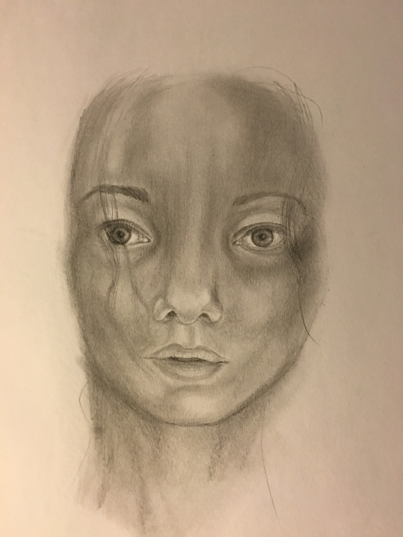
Before I could start painting a figure, I needed a composition first. I was initially hoping that I will be able to get a composition from the life-drawing class I attended, but as I could not sketch fast enough, the work I had lacked detail. Looking at Freud's work, he tends to paint his subjects on couches or in beds, which is what I think also provides them with a sense of intimacy. I am sure having a live model would be the most ideal approach, but this was not an option. Looking for images, I had difficulty finding what I was looking for. In the end I set up my camera and captured various poses of myself to find a position I was drawn to and created a sketch of the one I finally chose (below).

Figure on couch, pencil sketch, 20 x 29 cm
Before I began painting I thought about how I wanted to use colour. You will remember that when I experimented with figures during my practical research, I tried different combinations of colour to create skin tone. From the feedback of others, they favored to skin compositions, the natural skin tone and the one that combined the more dynamic reds. Thinking about complimenting colours, I considered how using the red tones in the skin could create a great compliment if I made the couch green. I thus chose to focus my colour compliments towards red and green.
1. I first enlarged my initial sketch onto the canvas. Using ivory, cadmium yellow, raw sienna and a mixture of turps and linseed oil, I first painted the background wall.
2. I then used sap green and burnt sienna to block out the couch. I worked wet in wet her, dragging and pulling the burnt sienna over the sap green to create tonal blends. As you will notice, I worked with a loose brush stroke that fades into other areas of the composition. I also incorporated some of the green and sienna into the background, which is similar to some of Freud's work.
3. I blocked out the skin of the figure with a single tone, using burnt sienna, orange, yellow ocre and mixing white. I wanted to have a natural base to start with so I could layer additional colours over it. With every layer I am placing on the canvas I make sure to continually drag elements of the different colours into each other.
4. I used the base skin tone I created and added more light red and orange to create a pinker hue. I used these in areas that would be considered mid tones on the skin. I also used this in sections of the couch where there are highlights.
5. For the blanket I used cadmium orange as I wanted to bring in a complimentary shade to the green couch. For tonal variation, I used crimson and burnt sienna. I also used viridan hue to add tonal variations in the couch, dragging some of this into the blanket. As the viridian hue has a slight blue shine to it, it helped to make the couch more vibrant.
6. Continuing to build layers I used some of the paint individually to keep enhancing tonal variations in the skin, applying the paint thickly. I generally dragged colour from one to another. I tried to keep strokes directional, according to the shapes of the objects.
7. I created a brownish-green mixture that I could use to help create additional shading that can help delineate form in the couch and figure. For the skin this meant I combined my skin mixture with viridian hue and a touch of brown. I also added turps and linseed oil, so it would act more as a glaze. This worked quite well as it kept the expressionist strokes as focus, while creating a more 3D look.
8. For the couch I used viridian hue, brown, linseed oil and turps to enhance the shapes and shades.
9. I finally used ivory and mixing white to apply a final set of highlights into the figure and couch. This really helped illuminate the overall composition.
10. The final step was to create a glaze using light red, orange and gloss which I used to glaze the background wall. I did this as I thought back at how well glazing the yellow worked with a red hue. It created a warm luminous glow, which I figured would work well here. As it enhances the area and creates a red glow this further compliments the use of green in the couch and ties the composition together.
reflection
I really enjoyed creating this piece. It is a new and exciting technique for me to explore and even though painting more freely and expressionistically can be challenging at times, it is also liberating.
In terms of achieving my aim, I think I have managed to focus on the variation and movement of the brush quite well and it shows in the close up details. Considering complimentary colours also helped to make the canvas vibrant. My research and closer observations of Freud and Shevlino's work provided me with useful ideas and techniques which I was able to use with my own interpretation. You can see how I incorporated colours from different objects to one another in order to create cohesion. The use of larger strokes are also evident in the close ups. I believe I have also managed to find a balance between what is defined and what is undefined. I definitely have chosen to create more definition in my figures than Shevlino did, but I see this as a positive thing, as it makes the method my own.
I did experience some difficulty in achieving some of the large bold sweeps that you can see in Shevlino's Yellow Cloth, but I think this is because I am working on a smaller scale. I would like to be able to explore this technique on a larger scale, but logistically this is difficult for my course work, as it has to be able to fit in my portfolio to sent off for marking.
reflection on practical research
Do you feel that you managed to investigate and hone in on artists’ techniques, processes, etc., in enough depth to be able to make a confident start on your own painting?
My figural experiments were very useful in helping me consider the impact of different tools and techniques when applying paint and definitely pushed me to exploring a more dynamic approach when focusing on brush strokes specifically.
My colour/ texture experiments were also useful in helping me consider how colours work together. Though I did not use knives for my final pieces, I always enjoy seeing what the can do.
If so, do you feel excited that you’re beginning to develop your own ‘voice’? How would you characterise that voice at the moment?
I mentioned in Part 1 that I would describe my style as a type of expressionistic realism. I believe that my experimentation in brush strokes and colour have certainly helped me to elevate this style. I feel like the pieces I made using this method have more energy and emotion behind them, so yes, this is exciting for me. As far as subject matter goes, I think figures and urban scapes will continue to be favorites.
Do you feel your work is now inspired by new knowledge gained through practical exploration (your experimental pieces), as well as your historical research? Can you now see how practice and theory work in tandem?
I am sure my contextual research and practical research has demonstrated that I understand the value of observing artists in history and applying concepts practically. In this unit I also took on the advice from my tutor to focus more on artists that I am specifically drawn to. That has been helpful in keeping me engaged with their work and finding elements that could inform my own practice.
reflection against the course criteria
Demonstration of technical and visual skills – materials, techniques, observational skills, visual awareness, design and compositional skills:
I have tried various paint application techniques during this unit, which shows that I am constantly pushing my understanding of how the materials and tools interact. I have made use of textual and visual research to help inform me on specific painting techniques, particularly watching videos about Freud, Shevlino and Richter. Even if I don't always use their methods exactly, these observations help me to gain visual awareness and they inspire to try new things. Along with my additional reading in this module, it has helped me to grow in considering compositions, particular when looking at colour.
Quality of outcome – content, application of knowledge, presentation of work in a coherent manner, discernment, conceptualisation of thoughts, communication of ideas:
I have sufficiently documented my process, showing that there is progression in how I acquire and use knowledge. I have used research to inform my practice and shown how this has lead me to plan my work. I have been specific in providing inspiration and thought processes to show how I completed pieces. I think my website shows this process in a coherent way, outlying my inquiry, planning, process and reflection.
Demonstration of creativity – imagination, experimentation, invention, development of a personal voice:
I have certainly pushed my creativity in this module as I tried new techniques. I have shown how I used the research and practices of other artists and add it to my own style to create something that is distinctly me. I didn't just copy techniques, I used them as inspiration, which I think is important, as the work still represents my voice.
Context – reflection, research, critical thinking:
I have done in depth research, not only using reliable websites, but also reading additional books and watching documentaries. I understand the value of art history as it provides context. It also shows progression and how one idea is informed by another, which helps you become more critical as an artist yourself, as you begin to question your own motivations. This unit really forced me to think about what subject matter I am drawn to and prefer painting. It also helped me push my boundaries on how to paint brushes. Before I thought that palette knives were the only way to create interesting textures and dynamic textures, but my experiments and final pieces have show me what the brush can do. I understand the importance of reflection, and hope that is evident in my website. After each contextual or practical study I make a point of reflecting on what I gained from the research or practice.
moving forward
Look back over your experimental pieces from Parts One and Two. Try to look objectively at the work and begin to form some ideas of how you can take them forward into painting. Give your tutor an idea of the direction you plan to take and enable them to decide how best to help you. Aim to produce around one page, using bullet points.
- From my work in part one, the pieces I am most excited about exploring was the studies I did on facial expression and how brush strokes and colour can enhance that.
- Even though I am greatly focusing on building my knowledge of working with oil, I am always creating watercolour compositions as well. One reason is because I like to see how the two mediums react differently to a subject and the other is because watercolour painting is so fast, which allows to see how a composition will turn out, without wasting to much time or materials. And finally, I love the emotion that watercolour evokes. I feel like a well composition watercopour painting has soul, and am really trying to find out how I can recreate this emotional response with oil. I have found my explorations in brush work and colour to be useful in making this response.
- Completing works based around either urban landscapes or figures is also help me hone in to which topic I might choose to continue enhancing. Perhaps for part 3 I can focus on urban and 4 and can focus on figures. Or I perhaps I should continue to create final pieces in each subject area? I am not sure what the best approach is.
- I have done practical exploration using only knives or only brushes, perhaps a next step could also be to explore combining techniques, as Turner did when he painted textures.
- I definitely want to keep exploring my brush work, in particular the expressionistic techniques inspired by Shevlino.
- I have thought about how painting figures can also have a message, which is why I want to create compositions that are not just about nudity or sexualizing form, but rather celebrating the essence of what makes us human, and I think that is where the brush stokes and colours can come in. They draw focus away from the actual figure and allow to consider the composition as a whole, showing that all things are connected, 'the fabric of life' in a way.
- I am also considering a topic which is in social media a lot right now, and this is the representation of men in the media, in particular what we consider to be 'manly'. I am thinking about how painting a male figure in poses that would be considered 'feminine' would make a strong statement and would work well as a series (which I . So I think it would be good to complete experiments in drawing or painting male figure, as this is not something I have done much. (Unless this is something to keep on the back burner for level 3?)
reflection on tutor feedback
I had a difficult time with the tutor's feedback as a concerned was voiced on whether I am meeting the standards of the course. I find it difficult to understand the expectations of the course and guide at times. It feels like research is very prescribed at times and you have to focus on particular artists, even if their work does not always have a relevance to you. With there be so many artists and ideas to explore, it does seem that work bounces around and struggles to find cohesion, which is what the tutor notes. I did try to hone in more in my research this time, and exchanged artists with ones who resonate with my style better.
I enjoy working with a vibrant and contrasting palette, but this method does not always translate to everyone's taste. The tutor notes that I need to try and be more subtle in my use of colour and consider what colours say about space. The tutor has made some positive comments on my figural experiments which makes me consider honing into larger areas that require less detail for future works.
The response on my Hong Kong architecture painting was mixed and it was noted that I should simplify and not over complicate. I myself noted that the oil painting did not turn out the way I had hoped, but I would have liked feedback on the watercolour of the same topic, as I think it was a more emotive and atmospheric depiction. I also tend to be more confident when painting with watercolours.
