Introduction
Be prepared to look at landscape in its widest sense. Consider a rural landscape that contains motorways, road signs, pylons, wind turbines and vast plains of cereal crops. The urban environment, too, where most of us live and work, presents many challenges and opportunities for the painter and is less likely to evoke visually clichéd responses.
Landscape as a distinct genre is relatively new in the history of western art. Prior to the eighteenth century, landscape existed mainly as a somewhat idealised backdrop to religious, classical and historical painting. It wasn’t until the late eighteenth century that the landscape was explored as a genre in its own right by the Dutch masters. Landscape subsequently became the predominant art form in paintings of the nineteenth century. The Impressionists, Neo-Impressionists and, later, the Post-Impressionists used landscape to explore both the appearance of our world and the nature of perception. In doing so, they expanded the possibilities of observation, selection and interpretation.
Landscape as a distinct genre is relatively new in the history of western art. Prior to the eighteenth century, landscape existed mainly as a somewhat idealised backdrop to religious, classical and historical painting. It wasn’t until the late eighteenth century that the landscape was explored as a genre in its own right by the Dutch masters. Landscape subsequently became the predominant art form in paintings of the nineteenth century. The Impressionists, Neo-Impressionists and, later, the Post-Impressionists used landscape to explore both the appearance of our world and the nature of perception. In doing so, they expanded the possibilities of observation, selection and interpretation.
Research Point
Do your own research into the evolution of landscape painting from the eighteenth century to the present day. Don’t just look at the large oil paintings by artists such as Constable. Many landscape artists (including Constable) have used oil sketches made on site as a means of recording the landscape for working up into larger paintings.
Note particularly some of the ways in which modern and contemporary artists have chosen to interpret this genre. To what extent does contemporary landscape painting reflect environmental concerns, for example?
Note particularly some of the ways in which modern and contemporary artists have chosen to interpret this genre. To what extent does contemporary landscape painting reflect environmental concerns, for example?
18th Century Landscapes
The interest in landscape paintings started growing during the late 18th century. The artist who were paving the way in landscape painting at that time became celebrated as the memorializers of the recent past.

Wooded Landscape with a Peasant Resting, 1747, Gainsborough
|
Thomas Gainsborough (1727-88)
He painted the sedate countryside of his native Suffolk, treating it in more in the modest, naturalistic manner of 17th-century Dutch artists than that of the French and Italians. Although he painted real places, landscapes were a form of release from painting portraits. He painted quickly, and the works of his maturity are characterised by a light palette and easy strokes. The colouring and detailing of the trees shows his appreciation for the forest and the environment. Having a single subject reflecting quietly is his way of letting viewer's know that this is where they should find solace. |
|
Joseph Mallord William Turner (1775-1851)
Turner scoured Italy, France and Switzerland for grand landscapes that he could treat in the traditional classicising manner – a foreground tree framing some human figures and a middle distance with, say, a river or a castle for interest, and a distant blue horizon. Even at his most idealising, however, as he sought to impart nobility of sentiment to his scenes, he kept a real landscape at the heart of the picture.He was an English Romantic landscape painter, watercolourist and printmaker, whose style can be said to have laid the foundation for Impressionism. I appreciate the sense of mystery that this artist has created through his work. He has used a limited palette and only some recognizable figures, leaving the rest for the viewer to interpret. It is also a great way of creating the illusion of motion. |

J.M.W. Turner 'Rain, Steam and Speed' 1844
|

Boys Fishing, 1813 - John Constable
|
John Constable (1776-1837)
He painted the places he loved best and because he believed that no two leaves of a tree were ever "alike since the creation of the world" his method was one of minute observation. He painted rapidly, wet-in-wet, using short strokes and a restricted color palette to train his hand and eye, and to enhance the realism of his later paintings. His images certainly feel like warm memories or 'flashbacks'. His meticulous detail helps the viewer to feel the texture of the environment, allowing the viewer to experience the atmosphere and appreciate it. |
19th Century
The nineteenth century was essentially an age of landscape-painters, and the most important developments in figure-painting were the result of applying the landscape-painters' outlook to figure-subjects. On the purely technical side this revolution can be traced to the work of certain particular painters, but though it found its expression in new technical methods, its causes must be looked for in a very widely spread change of attitude towards nature.
|
Richard Parkes Bonington (1802-1828)
The subjects of his landscapes are mostly French coast and river scenes, but in 1822 he visited Italy and painted a group of pictures in Venice. The characteristics of his landscapes are bright tone and colour, great clarity of atmosphere, and a most refined and delicate handling of paint. Through many of his paintings we start seeing how industrialization had started to effect the environment. The business of the rivers or canals, along with the foggy air in the distance. I appreciate the faint differences in the silhouettes of the skyline. |

A watercolour of Rouen, Bonington
|

Moorland Landscape watercolour, David Cox
|
David Cox (1783-1859)
His drawings are very fresh and breezy and have an energetic freedom of brushwork which was something quite new in water-colour and are the proto-type of much modern work.bHis colour is often blotted rather than washed on to the paper, sometimes dragged lightly over the surface and sometimes allowed to collect into pools, giving an impression of almost accidental spontaneity. He interprets his environments with a very simplistic approach, relying on the colours or the brushes to create detail or depth. |
20th Century
The 20th century gave rise to some of the greatest modern art in history. Except for Impressionism, it witnessed all the influential movements of modern art, contemporary art, colourism, cubism, constructivism and political art.
|
Richard Estes (b.1932)
The American painter and printmaker, painting scenes with extreme photorealism. His meticulous paintings (all based on photographs) celebrate sites of American popular culture, such as shop fronts, diners, internal spaces, parking lots, and street views. The images are famous for their almost invisible brushwork. His paintings are astounding in their detail, like when you watch a movie in HD. At first is almost seems unpleasant to the eye, until you are used to the crispness of the detail. His works show how urbanized our environments have become. |

Richard Estes, Horn & Hardart Automat, 1867
|
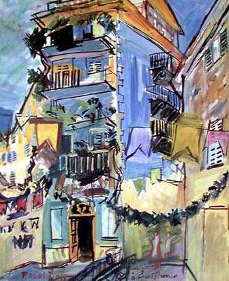
Raoul Dufy, "May, in Nice", 1930
|
Raoul Dufy (1877-1953)
A classically trained French painter, designer and graphic artist. He was first drawn to Impressionism before joining the Fauvism movement led by Henri Matisse. Later he was also influenced by Paul Cezanne and Georges Braque. As a result his style became more sober and monumental, before returning to the natural lighter style: a style distinguished by rapid calligraphic-type drawing over bright backgrounds of thin colour. Painting urban scenes in this type of impressionistic style, eludes the chaos and diversity that can be found in the cities. I quite like how he has created the really dark outlines of his shapes, it almost feels like a modern colouring book. |
21st Century
|
Alex Colville (1920-2013)
He studied at Mount Allison University in Sackville, New Brunswick where he became interested in Post-Impressionism and it could be said that Colville's technique owes a debt to Neo-Impressionism. In this technique, small, cross-hatched touches of colour are built up on the picture surface with fine sable brushes that are only visible upon close examination; from a distance they give the effect of luminosity. Most of his works incorporates figures in the environment which makes me think that he believes there is a harmony between people and their environments, even if idolized. |

The French Cross, 1988, Alex Colville
|

Stroll with friend, Leonid Afremov
|
Leonid Afremov (b.1955) He is a Russian–Israeli modern impressionistic artist who works mainly with a palette knife and oils, using bright and positive colours.His paintings usually reflect certain personal memories and emotions. Leonid tries to draw the viewer to have a certain feeling rather than telling a story. Leonid Afremov has been traveling quite extensively and has taken many photographs of different scenes that he later painted. Almost every painting he painted has a very personal inspiration. I appreciate the bravery it takes to work in these crisp colours and have so many unfinished lines. It is incredible how the buildings just fade into the background and yet it feels done with such a great purpose. His paintings certainly do evoke feelings or emotions, mostly a sense of romanticism or longing. |
Banksy
He is a controversial graffiti artist in the UK whose identity is not really known.He is most known for his stencil art that he spray paints around cities that often have a controversial political message. He also creates awareness for other issues, as shown through his exhibition entitled Existencilism, which was held in 2002. Banksy used a unique way of satirizing the works of the great masters while paying homage to their acclaimed pieces. The two images below bring a rude awakening to our destruction of the environment due to our need for money and material things.
He is a controversial graffiti artist in the UK whose identity is not really known.He is most known for his stencil art that he spray paints around cities that often have a controversial political message. He also creates awareness for other issues, as shown through his exhibition entitled Existencilism, which was held in 2002. Banksy used a unique way of satirizing the works of the great masters while paying homage to their acclaimed pieces. The two images below bring a rude awakening to our destruction of the environment due to our need for money and material things.

Show Me The Monet - Banksy
|

Dancing Butler On Toxic Beach Crude Oil by Banksy
|
Project: From inside looking out
The framing that occurs at the threshold of our homes is part of our day-to-day mental landscape. But what lies outside is not fixed. The view changes from minute to minute, depending on the light, the weather, the time of day and the season. But even allowing for these changes, our perceptions of what’s there are often very different from what we can actually see if we spend time looking and recording.
Exercise: View from a window or doorway
For this exercise, choose a view onto the world. Decide how much of the interior you wish to include and where the main focus of the picture will be.
It may help you to look at some of the ways in which other artists have tackled this type of composition. Go on the internet and briefly look at the work of Raoul Dufy, who painted many views onto sunny Mediterranean scenes from interiors, suggesting a cool retreat from the hot, dazzling world outside. By contrast, consider the work of Gwen John who exploited the gloomy claustrophobia of what lies within, and the stark emptiness of what lies without. Edward Hopper created links between exterior and interior worlds that render the spaces inhabited by people almost as stage sets.
It may help you to look at some of the ways in which other artists have tackled this type of composition. Go on the internet and briefly look at the work of Raoul Dufy, who painted many views onto sunny Mediterranean scenes from interiors, suggesting a cool retreat from the hot, dazzling world outside. By contrast, consider the work of Gwen John who exploited the gloomy claustrophobia of what lies within, and the stark emptiness of what lies without. Edward Hopper created links between exterior and interior worlds that render the spaces inhabited by people almost as stage sets.
Raoul Dufy

Dufy, Dusk at La Baie des Anges, Nice (1932)
|
Landscape of Esterel, 1926 - Raoul Dufy
|
I find it interesting that he uses really black outlines for his images. It makes it feel like a colouring book image. Although he has used some perspective the image still feels a bit flat. He has worked very boldly with his colours, particularly with rooftops in the distance. I prefer his farm scene as the colours have a greater sense of harmony and the composition of the elements create a greater intrigue.
Gwen John

Gwen John: Landscape of Tenby with figures
|

Rue Terre Neuve, Meudon - Gwen John, 1920
|
I appreciate his toned down palette and how all the elements in the painting work together well. He has also make good use of light in the images, which make certain parts stand out and creates a more interesting contrast.
Edward Hopper

Western Motel
|

Lonely view from a room in Brooklyn
|

Nighthawks
|
He puts a great deal of thought into the composition of his images. There is a great sense of though in each line and colour used. These images are really clean and harmonious. I also like his use of light. He has a clear light source and it creates interesting silhouettes and focal points. His style of painting appeals to me most of the three.
Sketches
Make some preliminary drawings in your sketchbook, trying out a variety of arrangements and viewpoints. You may find it helpful to make a simple tonal study so that you can assess the pictorial value of the main tonal arrangements of the picture.

View towards the back of the village.
|

View towards the front of the village.
|
Photos
 Planning Sketch
As I live in a village house in Hong Kong that is quite densely packed and all our windows look out onto someone else's wall. However, we do have a more interesting view from our rooftop, so I decided that that would be the best vantage point.
Above you can see sketches looking out from both sides of the roof top. I decided to work with the view towards the back of the village.Hong Kong homes are not really pretty, they are cluttered with tiles, pipes and air conditioners. Therefore, when I planned my painting, I really wanted to simplify the composition. I wanted to almost create the illusion of it being a Tuscan village, which is why I stuck with a limited palette, using browns and yellows. I wanted the rooftops to be uniformed, but also to help create some contrast.
Aim:
To work with a limited palette and create a sense of architecture that doesn't feel like Hong Kong, but that a resident would still recognize as such.
Composition:
It was important for me to remove some of the clutter and really simplify the composition. I definitely wanted to include the mountains and TV antenas, as they are a real focal point when we are up on the rooftop.
Mood and Atmosphere:
By using a limited palette I hoped to create a sense of warmth and unity between the different houses. I wanted the atmosphere to be reminisent of a Tuscan village at dusk.
Process:
I spend almost a good hour or so first getting the composition sketch correct. As I had already sketched the view before, I also used that as a reference, only slightly changing the viewpoint. Once I had the sketch in place I mixed shades of yellow and brown to create the palette I would work with throughout the painting. During my first session I completed the walls. The next day I started working on the sky. The weather in Hong Kong has it's ups and downs. It is often foggy or polluted, so having a clear or crisp sky can be few and far between. I used the photo I took earlier in the week to help place some clouds in the sky. It helped me to see how the clouds formed around the mountains and notice some of the highlights and shades. I finally worked on the rooftops, keeping them all the same colour. I also decided to keep the metal canopes red to have a cohesive look. The tiles were difficult, especially trying to show how they get smaller due to perspective. I probably would have liked to create a bit more shadowing in the rooftops, but I found it quite hard to work with such fine detail. But then I remembered Raol Duffy's sketchy urban scenes, and it encouraged me that having them simply painted but well placed can still be effective.
Reflection:
The final painting has met some of my original ideas. When showing it to Hong Kong friends, they immediately recognize the type of architecture used in the villages, but that the coloring creates a different mood. I'm quite happy with the buildings, particularly the shadowing in the walls. I like the colour contrast of the rooftops, but I may have wanted them to appear a bit more interesting. I created some good texture in the sky, but had difficulty translating this into the mountains.
Exercise: Hard or soft landscape
For this painting exercise, choose a view of either a ‘hard’ or ‘soft’ landscape; this could be interpreted as urban or pastoral (although a rock formation would be hard rather than soft). Take the concept of soft landscape to mean one with soft edges such as trees, shrubs, plants and flowers, rather than the hard lines, angles and forms of buildings in an urban landscape.
The Venice Canals are a popular travel destination for many. During my visit there in 2013 We took more than enough photos of the buildings and canals. The colour schemes, architecture and bridges creates interesting compositions. You can literally point your camera in any direction and probably still get a captivating image. this would be classified as a 'hard' landscape. I created some interesting palette knife textures in the previous unit, and it reminded me of the walls in Venice. I wanted to use these techniques to capture it. I wanted to work more loosely, not being to strict on exact shapes of buildings. Using the knives would also be a great way of capturing the hard lines found in architecture. I worked with colours that are relatively closely related, beginning with a terracotta base, which you see all over Venice.
Aim:
Crete a hard landscape with palette knives that is textural and expressive, but is still geographically recognizable.
Reflection on final painting:
I was very nervous about just painting loose and not outlying every part of my composition as I normally do. I looked at reference images, but generally went with my gut, placing lines as they felt appropriate. I certainly succeeded in pushing myself out of my comfort zone and I believe the result is a happy one. Friends of mine who have visited Venice, immediately recognized the setting and remarked on how the colours especially reminded them of the canals. Every tine I work with the knives I become a bit more comfortable with the techniques, though I'm sure there is still more to learn. The textures created are warm and slightly abstract, which adds interest to the work. I consider this a good first attempt at creating a hard urban landscape.
Project: Perspective
The traditional western means of creating an impression of three dimensional space is through linear and aerial (or atmospheric) perspective. Some artists present unusual or bent perspectives to give a different and sometimes unsettling view of the world. In fact, shifting perspectives have become a commonplace in the work of many contemporary landscape painters.
Linear Perspective
A system of creating an illusion of depth on a flat surface. All parallel lines (orthogonals) in a painting or drawing using this system converge in a single vanishing point on the composition’s horizon line.

Aerial Perspective
Also called atmospheric perspective , method of creating the illusion of depth, or recession, in a painting or drawing by modulating colour to simulate changes effected by the atmosphere on the colours of things seen at a distance.

Exercise: Linear perspective
Find a location in which there are hard landscape elements. If you live in a town, you could simply look out of your window or door. Or you could find a location inside a large public space, such as a railway station or shopping mall, or work from a bench in the street. Look at all of the elements that you can exploit to convey a sense of space. Is there street furniture such as benches, street lamps or litter bins? Look at gateposts, walls or fences that recede in size into the distance. Consider how you can exploit lines along the road edges, curbs, walls, windows and doorways. Note the outlines of buildings, roofing and guttering that can be represented as lines receding to achieve linear perspective.
Getting ready
Earlier in the year I attended a workshop run by a watercolour artist who specializes in Hong Kong urban scenes. She particularly likes taking photographs of the city that depict perspective. Painting landscapes or urban scenes always seemed too daunting or intricate for me, so I knew it would be a good challenge. She showed us her methods and how she works and it really helped me to gain some confidence in capturing an urban scene.
Step 1: Find the Vanishing Point - The first thing she does when looking at her reference photograph is to pin point the Vanishing point and then drawing the diagonal lines out from that point almost like a star. She worked in a very loose manner, not being pedantic about straight lines or every detail. (A good lesson for me too learn!)
Step 2: Composition - Working from the Vantage Point outwards, she starts adding in the details that she wants, first blocking out big shapes and then deciding which smaller details she wants to keep.
Step 3: Blocking large colours - she works with a limited palette and favors cool colours
Step 4: Layering - creating more contrast and shadowing between shapes
Step 5: Final touches (In my paintings, the final touches was using ink pen to create further definition. The artist did not use this method)
1. Suzhou Water Canal Scene

|

|
The sketches above show how the location of the Vanishing Point can help to plan the rest of the image.
Reflection on finished product:
I visited a great heritage village in Suzhou China in April and captured a great moment where a merchant was traveling up one of the canals. Working from that image I followed the same steps to create my perspective piece. I am not fully satisfied with how the paint reacted, as I wasn't using the correct paper. It wasn't quite porous enough, so the paint didn't blend as I hoped it would and thus I don't feel that the colour composition is as strong as it could be. As for the linear perspective, I believe I captured the sense of distance quite well. The buildings become smaller and the pathways narrower as they recede towards the Vanishing Point. Details also become less refined as they move further from the viewer's eye, specifically the set of sky scrapers in the distance.
I visited a great heritage village in Suzhou China in April and captured a great moment where a merchant was traveling up one of the canals. Working from that image I followed the same steps to create my perspective piece. I am not fully satisfied with how the paint reacted, as I wasn't using the correct paper. It wasn't quite porous enough, so the paint didn't blend as I hoped it would and thus I don't feel that the colour composition is as strong as it could be. As for the linear perspective, I believe I captured the sense of distance quite well. The buildings become smaller and the pathways narrower as they recede towards the Vanishing Point. Details also become less refined as they move further from the viewer's eye, specifically the set of sky scrapers in the distance.
2. Hong Kong Urban Scene

|

|
The sketches show the Vanishing Point and Composition Plan.
Reflection on finished product:
The Hong Kong city scape comes alive at nigh, particularly on the island side. the challenge of these settings though, is that they are busy, colourful and overly cluttered. Potentially you could include all of these details, but then the work becomes complicated and time consuming, not always easy if you are working with a deadline, or working with watercolours. Working from an image I had taken one night out, I had to first make decisions of what to include. My priorities were to get the perspective right and placement of the buildings relative to the road and vehicles. I therefor decided not to include any pedestrians. I wanted to keep the palette a bit cooler, but liked the idea of the plum colour being shown in various areas.
I am pleased with the perspective and I think that the vanishing point is clear. I like the simplicity of the image, though I would like to attempt something similar with some of the added details. Yet again, this was not the best quality paper, but it brings a different aesthetic to the final product.
Exercise: Aerial perspective
Aerial perspective is a device used by many landscape artists. An illusion of distance and receding space is created in three ways:
• Controlled loss of focus (in terms of sharp delineation between different tonal areas) and fading outlines are rendered through progressive loss of contrast into the distance.
• A loss of colour saturation, i.e. a fading out of bright, saturated colours going into the distance towards more muted, faded shades.
• Distance can also be achieved by colour temperature. Warm colours painted in the foreground will automatically achieve a sense of closeness against colder colours in the distance.
Paint a simple landscape in which you exploit these three devices of aerial perspective. Which device did you find most effective or is it necessary to combine all three to achieve the desired effect?
Planning:
While scrolling through Instagram I found this image that really made may think 'Oh, I want to go there'. It felt really quiet and romantic. I'm sure the photographer used filters on it, but I particularly liked the contrast of the blue-yellow and onrange-purple which are complimentary colours. I decided to first created a base blue background, mixing Ultramarine, Phato Blue and Violet. I placed a grid on the image and then simply sketched a few rough outlines with a pastel to guide the composition.
Aim:
To capture the complimenting colours while showing the concept of aerial perspective.
Reflecting on final product:
I get a sense of aerial perspective as the is a contrast between the hues of blue as the move from the foreground to the background. In the original the the background is a much softer hue, almost looking light grey, but I quite liked the sparks of orange and yellow, so I chose to enhance those slightly, realizing that that might take away from the full effect of aerial perspective, but I think it still works for the image.
This type of painting is not really my taste, but I enjoyed working freely with the brush and blending colours on the canvas.
Project: Expressive landscape
Most landscapes are painted with a degree of subjective choice over mood. Dark menacing clouds stacked up in the sky, a sunset or a misty landscape will all evoke particular memories and emotions in the viewer. We can’t help but impose psychological, emotional and symbolic interpretations on the landscape, whether it’s experienced directly, observed and interpreted or imagined. In this short project, you’ll let loose your own subjective response to landscape and explore ways of conveying mood and atmosphere in the observed landscape.
Research Point
Look at the eerie, dream-like landscapes painted by the Surrealists. The weird places created by Salvador Dali, Max Ernst and de Chirico convey times and places that are not of this world. Consider the work of some artists who have sought to express the more emotional and subjective aspects of landscape, for example war artists such as Paul Nash and Graham Sutherland. Look at landscape paintings by the German Expressionists – in particular Emil Nolde – and by artists of the Symbolist movement (Gustav Klimt, Gustave Moreau, Leon Bakst, Frida Kahlo, etc.).
Salvador Dali (1904-1989)
Dali's oil paintings were small collages of his dream images. His work employed a meticulous classical technique, influenced by Renaissance artists, that contradicted the "unreal dream" space that he created with strange hallucinatory characters. He referred to his method as a mental exercise of accessing the subconscious to enhance artistic creativity.

Swans Reflecting Elephants - Salvador Dali, 1937
|

The Persistence of Memory (1931)
|
Max Ernst (1891-1976)
Max Ernst was born in Bruhl, a place near Cologne, in Germany. It was his memories of the war and his childhood that helps him create absurd, yet interesting scenes in his artworks. Ernst was one of the first artists who apply The Interpretation of Dreams by Sigmund Freud to investigate his deep psyche in order to explore the source of his own creativity. While turning inwards unto himself, he was also tapping into the universal unconscious with its common dream imagery.

The Temptation of Saint Anthony, Max Ernst, 1945
|

The Joy of Life, Max Ernst, 1930s
|
Giorgio de Chirico (1888-1978)
He encouraged the Metaphysical Art movement, a style which created a sense of mystery through the use of dreamlike imagery; objects often appeared in strange, unfamiliar contexts. A reaction against Cubism and Futurism, Metaphysical art paved the way for Surrealism. His work was eerie and theatrical.

The Melancholy of Departure, de Chericio (1914)
|

The Enigma of an Autumn Afternoon, de Chirico (1910)
|
Paul Nash (1889–1946)
Born in Britain, he was a surrealist painter and war artist. He played a key role in modernism in English art. His work could be described as decorative, abstract, surreal and lined with symbolism.

Wire, Paul Nash, 1918
|

A Scarred Battlefield, Paul Nash, 1918
|
Graham Sutherland (1903-1980)
Painter of imaginative landscapes, still life, figure pieces and portraits.His work is much inspired by Welch landscapes, religion and the Second World War. His style is impressionistic and abstract. His use of colour is often vibrant and unconventional.
Graham Sutherland, Twisting Roads, 1976
|

Red Sky, Graham Sutherland, 1944
|
Emil Nolde (1867-1956)
HE was a painter and printmaker, particularly know for his colourful watercolours and expressive brush strokes. He was a member of the "Brücke and a leading expressionist. He is known for his vigorous brushwork and expressive choice of colors.

North frisia, Emil Nolde, no date.
|
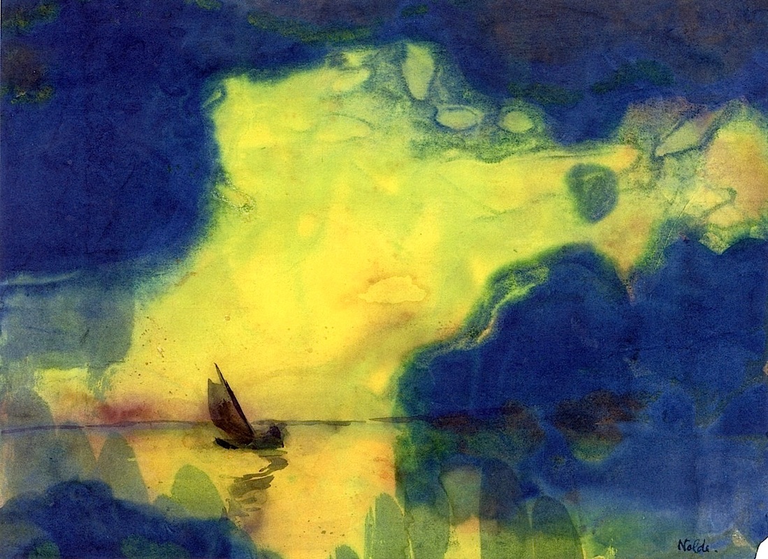
The sea at dusk, Emil Nolde, no date.
|
Symbolist movement
This movement began during the late nineteenth century and it was used in both art and literature. Symbols were used to create meaning, either through the choice of colours, shapes lines or forms.It was the forefront of modernism, helping artists to consider abstract means of creating the physical and psychological world. The emphasis on emotions, feelings, ideas, and subjectivity rather than realism.

John William Waterhouse, Cecilia, 1895
|

Victor Vasnetsov, The Knight at the Crossroads, 1878
|
Thoughts and Conclusions
These artists have certainly given landscape art a fresh look. For me personally as an artist it is still much easier to paint what i see. Sure I cans still experiment with the style, composition and colour, but the idea of creating something that is so abstract and symbolic seems quite difficult to me. One of the things that actually stands out to me most is the simplicity of some of the works above. For example the very curved and obvious lines that Graham Sutherland used in his paintings. Though he doesn't include fine details and overly complicated compositions, he has a fine eye for the placement of colour and creates a great sense of intrigue and harmony with his paintings. I also appreciate how de Chericio used very clean lines and colour combinations to show his urban scenes. Not fussing over too many details gives the images a sense of tranquility. But of course the work of Ernst and Dali are truly inspiring. The freedom and creativity it takes to place so many intricacies and contrasting ideas in one space must be something that comes from inside. If I tried to work like this, I would fear it becoming messy and unrelated, but they seem to have a great precision in their 'randomness'. They certainly give you a lot to think about in terms of composition.
Exercise: Creating mood and atmosphere
For this exercise, either create a completely new painting that evokes a powerful atmosphere of some kind or re-work one of your earlier paintings. First, identify clearly what you’re trying to achieve – the mood or atmosphere that you’re aiming to create. However you choose to approach this exercise, make extensive notes about the techniques you’ve adopted to achieve your stated aim. When you’ve finished, reflect on the success of your completed work.
During Part 3 of this course I created a watercolour portrait using the idea of paint dripping or spreading on the canvas. Aside from the dripping technique, I also used very bright and contrasting colours. I was curious what this technique would look like if applied to an urban landscape.
|
I knew I wanted to use the Hong Kong skyline as it is quite iconic. Many advertisements, banners and pamphlets here make use of the iconic skyline, as it is internationally recognizable. I knew trying to paint it in great detail or in a realistic way would be complicated, so I focused on silhouettes and outlines. As you can see from the image on the left, the skyline is quite wide, so I needed to edit the scene down to the buildings I wanted.
|

Hong Kong Skyline outline.
|
Aim:
Create an atmospheric city skyline using colours that resemble sunsets.
Planning:
1. Create an outline of the buildings wanted in the skyline.
2. Create a 'sunset' type atmosphere background allowing colours to bleed. I did this using yellow, orange, red and blue.
3. Trace skyline over using carbon paper
4. Use black to fill in the building silhouettes
5. Use ink pen to create a more sketchy and structured look.

This painting was my first attempt. After watching a few videos on how to bleed watercolours, I tried the technique. However, I use to much water and the paper wasn't able to handle it. I had applied the colours and left to let it dry, when I returned, the water pooled in areas as the paper crinkled, leaving ugly water stains. Even so, I still traced the skyline image onto it, so I can still get an idea of what it would look like.
Using different paper, I first tried different brush strokes and amounts of water to get the effect that I wanted which you can see on the images below. Even though these look better, they still created water marks, as the paper was not porous enough.
Using different paper, I first tried different brush strokes and amounts of water to get the effect that I wanted which you can see on the images below. Even though these look better, they still created water marks, as the paper was not porous enough.

|

|

|

|
Expressive Hong Kong Skyline

Hong Kong City, 25x35cm, watercolour, RM
Expressive Shanghai Skyline
We visited Shanghai earlier in the year and that skyline is also quite iconic and interesting. I used the same methods, however, I decided to use only a thin ink pen to create the outlines. This makes it appear a bit more sketchy.

Shanghai City, 25x35cm, watercolour, RM
Reflection:
though I ha difficulty with the paper and getting the look I wanted right, the two pieces still turned out well. I posted the Hong Kong skyline on Facebook, and it was the most comments I had gotten on one of my pieces. People kept offering to purchase the pieces. I believe it has created an atmosphere, the colour makes the skyline feel warm and almost romantisized.
though I ha difficulty with the paper and getting the look I wanted right, the two pieces still turned out well. I posted the Hong Kong skyline on Facebook, and it was the most comments I had gotten on one of my pieces. People kept offering to purchase the pieces. I believe it has created an atmosphere, the colour makes the skyline feel warm and almost romantisized.
Expressive Landscape (Mountain scene)
I was also curious to try dripping paint with oils. I watched some videos on YouTube to get some ideas of how other artists do it. I decided to use a simple Mountain/Dessert scene in order to keep the image simply. I worked with earthy colours that are easily associated with a barren landscape.
Aim:
Use a dripping method to create a different mood.
Method:
Using brown, light red, yellow, grey and white I create different shades for the mountain/dessert scene. After blocking out the composition, I worked from the background to the foreground. First I laid down the sky. while the paint is still wet I dipped a wide flat brush in turps and dabbed it all around the sky to create the dripping. I repeated this method for the middle ground as well as the foreground. Once this was dry, I used a these colours to go back and add additional contrasts.
Reflection:
This was really more of an experiment to see how the paint behaves. I particularly like the effect it has on the sky, but I'm not sure whether the shack in the foreground suits the composition. I think the method is quite interesting and may be more effective on a different subject.
This was really more of an experiment to see how the paint behaves. I particularly like the effect it has on the sky, but I'm not sure whether the shack in the foreground suits the composition. I think the method is quite interesting and may be more effective on a different subject.
Project: Painting outside
For this project, you’ll move beyond the threshold of your home and observe and paint a landscape working largely outside.
Points to consider:
Points to consider:
- choice of view, palette of colours and method of applying paint
- how to frame the view,
- how to position their human subject in the landscape.
- compose your picture so that the horizon appears either high or low.
- try not to bisect the picture vertically.
- Diagonals, on the other hand, lead the viewer into and through a picture space; they locate the viewpoint of the artist and therefore the viewer. An illusion of space is created and a sense of distance achieved.
Research Point
Research the ‘Golden Mean’ (also known as the ‘Golden Ratio’ or ‘Golden Section’) and its application to artistic composition. Don’t get bogged down in the maths of this! Essentially, the Golden Mean is a proportion in which a straight line or rectangle is divided into two unequal parts in such a way that the ratio of the smaller to the greater part is the same as the ratio of the greater part to the whole. Find out also about the ‘rule of thirds’ in landscape. Renaissance artists realized that placing the main subject in the center of a composition often led to unsatisfactory results. It’s possible to get a more balanced composition by splitting the canvas into thirds, both horizontally and vertically, and placing the main subject on one of these lines or at the intersection point of any two lines. In many landscape paintings, the horizon lies on one of the grid lines and there may be a point of interest where two of the lines cross. Another way of thinking about this is to plan your landscape in terms of foreground, middle ground and background. Look on the internet and find some examples of landscape paintings that exemplify these compositional principles.
Golden Mean (Ratio)

|
It is the golden number 1.618 (rounded). It is a great tool for design, photography and art. It helps to create pleasant aesthetics and visual harmony.It was used extensively during the Renaissance period by Leonardo Da Vinci and he referred to it as the divine proportion.
Creating images based on this rectangle your art will be more likely to appeal to the human eye. It can be seen in much of today's art, whether it be a still life, portrait or landscape. It will be especially useful for me to consider this when painting urban scenes. |

Rule of Thirds

|
The Rule of Thirds is really just a simplified version of the golden mean and works on a similar principle of the eye being more attracted to certain areas within a rectangular shape. It serves as a great tool for improving the composition of photographs and art. It is specifically useful in photography and cinematography. Redirecting the focal points of a particular image to the thirds of the rectangle creates a more interesting subject. These will be very important when considering the placement of lines in buildings, horizons or mountain tops.
|
Foreground, middle ground and background

|

|

|
Understanding the foreground, middle ground and background is also important for composition. It will also be useful when starting to apply paint. Looking at objects that are closer to you, they should appear larger and often (but not always) brighter than objects that are further away.
As an artist , you can also decide what will be your focus point through your placement of subjects. Just because there is something in the foreground, it doesn't necessarily mean it is the main focus. For example, the tree and building in the painting above, are more of a focal point than the people in the foreground. The bridge and mountains in the background, help to put the whole image in perspective. |
Check it out!
I attended a one week photography course where we covered the ideas of composition and Rule of Thirds. We were also taught about the more technical aspects of working with the camera, including aperture and shutter speed.
You can take a look at some of my favorite images here.
I also completed a cinematography course in 2014 where I learned the foundational principals of how to frame a subject and create an interesting sequence of events. You can take a look at one of the short films I created here.
You can take a look at some of my favorite images here.
I also completed a cinematography course in 2014 where I learned the foundational principals of how to frame a subject and create an interesting sequence of events. You can take a look at one of the short films I created here.
More Examples

Cafe Terrace at Night Vincent Van Gogh, 1888
|

Diana and Actaeon - Jean-Baptiste Camille Corot (1836)
|

Digital photo BY JOSEPH MALLORD
|

Georges Seurat: Bathers at Asnieres 1884
|
Exercise: Painting a landscape outside
As you look for a suitable viewpoint, consider the overall composition of your picture. How will you divide up the picture space? Will you have a wide expanse of sky or an extensive foreground? Is there a feature such as a building, tree or gateway that can provide a focal point for your composition?
Make several rapid sketches from different angles. This will help you to frame your painting. Work out the horizon level or dispense with it altogether. Look for contrasting tonal areas that will create dynamism. Make colour notes and take some photographs. Be aware of how you can exploit linear or aerial perspective in the view that you’ve chosen to paint. Locate what’s near or far or in the middle distance; details and features will help you with this.
Decide how to approach your painting. You can sketch in light outline shapes with a light diluted neutral shade or you can begin by laying down areas of tone or colour. If you’re working in oils you’ll have to be cautious about inadvertently mixing from one area to another. Don’t be afraid to leave bare areas of the support. The sketchy and loose nature of
paintings completed outside can have a power that is hard to replicate in the studio.
In a successful painting, all parts of the composition hang together as a whole rather than reading as a set of disparate parts. One way to ensure this is to set up colour echoes from one area of the picture to another. For example, you might bring in touches of blue from the sky into foreground grass or trees, or touches of the land colour into clouds so that the picture has an overall unity of colour. Landscapes often fail because the sky seems unrelated to the land, especially when the sky is clear blue. The same can be said for brush strokes. Try to maintain some consistence with your brushwork.
Make notes throughout the whole process – on your preliminary visit(s), during painting and after you’ve finished. Write a commentary (around 500 words) in your learning log reflecting on your experience of painting outdoors and what you’ve learned from it.
Exploring outside
The weather in Hong Kong can be tempramental, particularly during September and October as pollution often moves over from Mainland China. This is also typhoon and monsoon season, so finding clear days can often be tricky. As I am also working during the days, it really only leaves weekends to plan an outside painting session. On one afternoon when though, just after a typhoon had passes through, the skies cleared and we had lovely days. I took the opportunity to walk around the coast just by my village and take some photos and get some inspiration for possible compositions.

|
There was a great moment where the sun lit a jetty running down into the water. I was drawn to how the wooden beams created a hard contrast against the softer lines of the ocean and mountains in the background. I returned on the weekend to create a quick reference sketch to help me plan the composition.
|

|
Aim:
Capturing what I see in a natural and realistic way.
Work in progress:
Day 1: My first day I spent a good chunk of time first plotting out the diagonal lines of the jetty, as I knew I wanted to start with the background first. I used the reference sketch to help me. Once I was happy with the placement, I began with the sky, using 3 different shades of blue, grey and white. Next I blocked out the water and sand. I just laid down a base colour, as I had already been painting for over 2 hours and wasn't able to stay any longer. As I was only able to work again on the next weekend, I chose to put the added shading and tonal differences in the sand and water at home. This would also allow the oils to dry before the next weekend.
Day 2: I returned the following weekend, but I could not work at exactly the same time, as it had started raining again. The tide and the light was different on this day, but it didn't affect the appearance of the jetty that much. I put down the first layer of the jetty using a mixture of dark brown, ocre and yellow. Then I layered some shadows while the light was still crating contrast on the beams.
Day 3: After the jetty painting session the weather turned and we had heavy rain for nearly 3 weeks. I made the decision to finish the part remaining in studio. The last parts to add, were the mountains and a bit more shadow detail to show that the light source is coming in from the right side. I used combinations of emerald green and brown to fill in the mountains, trying to create texture by dabbing the brush on the canvas. to create additional shadows on the beach and jetty, I used a wash. This helped to make them a bit more subtle.
|
I was not very pleased with the final product or the experience, so later during this unit I decided to try one more time. This time I wanted to keep it simple.
Aim: Create a simple landscape of what I see in one sitting with two colours. My plan was to use just two tones of water colour and just sit for a 2 hour session creating a painting. I found a new spot to sit and chose a different angle to work with. I created a quick sketch to get the composition I wanted and then just worked with blue to paint out the first layer. I then added additional shades of blue and black to created depth and in particular to show aerial perspective. |

|

|

Tseng Tau Waterfront, 33x46, watercolour, RM
|
This type of soft landscape is still a challenge for me, but working in one sitting and only two colours was a much easier task. The painting captures the scene with some depth and shows the use of areal perspective.
Commentary
It is highly likely that every artist has had dreams of going to Paris and sitting next to the banks of the river Seine painting to their hearts content. It is easy for those of who study painting to romanticize this idea, as you look at the work of the old masters. Their methods were precise, glamorous and time consuming, something we are trying to aspire to. Unfortunately as with most things, the reality often does not live up to the expectation. At least, this was the case for me.
Hong Kong, where I live, is a vibrant and eclectic city. On the island, you have the incredible sky scrapers, lighting up the skies, while on the main land there are rare gems of old Chinese architecture. Not to mention the New Territories, where we stay, which is abundantly covered by lush green mountains and surrounding oceans. All of these sound like a match made in heaven for painting outside, except for a couple of snags. the weather is constantly changing, between fog, pollution, rain and typhoons, there are only a few rare moments to capture your subject. Not to mention that it is 32 degrees out with 100% humidity! Public transport is the main mode of transport here, so you always need to consider the convenience of going to other locations.
Even though there were many areas that I would have been keen to paint, I decided to stay close to home. Our village is near the water and surrounded by mountains. This sounds easy enough, but the idea of painting soft landscapes truly frighten me. Firstly it is not quite my taste in subject matter and secondly I just find it really hard to paint it accurately. This is why my aim was to challenge myself to paint what I see (observe). I went for a walk about on a rare clear day, taking photographs of various subjects. I found a jetty that I felt looked interesting and decided that it would be my subject.
Using the photographs I took, I collected a few paints to start painting the background with. Blues, white, yellow and brown. I placed my paints and two brushes in my artist’s pouch, took my light metal easel, wooden board and canvas and headed down to the water side. On the first day I realized how difficult it can be to create a composition. I erased the charcoal I was working with several times. Eventually I used on of my reference photographs to help me gauge where I needed to place lines. During my second session, the light and tide had changed, even though I was on location at a similar time. It wasn't too bad though, as the most important part for me, was getting the perspective of the jetty right and placing shadows appropriately.
After my second sessions, the heavens opened in Hong Kong and we had a succession of rainstorms, monsoons and a typhoon. I made the decision to do the mountain and a few finishing touches at home. I believe I met my aim of painting what I observe with some accuracy. But what else have I learned through this experience:
- Always carry bug spray when working near water!
- Pre-determining colours may limit your composition.
- The weather is not your friend.
- It is good to challenge yourself with things that are uncomfortable.
- There are no mistakes, only methods or techniques we shouldn’t use again.
Project Working from drawings and photographs
So far in this course you’ve been asked to paint from direct observation but working on more ambitious subjects that you may not be able to complete in one sitting, or can’t get back to, requires additional skills.
Exercise: Painting from a working drawing
Choose a subject that you’re already familiar with, such as a corner of a room in your own home, or objects on a table by a window, and make three drawings:
• a linear study, concentrating on the main shapes
• a tonal study
• a colour study.
Don’t make the drawings too large. In your colour study, paint quite boldly; don’t try to make a detailed description of the objects, but instead look for the dominant colours and any effects of light that interest you. You’ll find it easiest to use the same medium for this study as you will for the final painting as all painting media behave differently.

Linear study
|

Tonal study
|

Colour study
|
Due our smaller living space, there really only was one side of the room that provided a good angle. I did look at different angles and also how the room looked differently with the lights on, but ultimately decided to use natural light. We don't have much natural light, due to us being wedged in between many other homes. From my sketches I was able to draw a very accurate enlargement of the image. As I was working on A2 I chose to use a ruler to create the lines. I knew I wasn't going to paint them this strictly straight, but it was just to make sure I got the perspective right.
I had already planned that I was going to do a Van Gogh style bedroom, so it was just a matter of choosing colours, as my room is really just black, white and grey. I already had the colours in mind, but the tonal study helped me to confirm what colours would match each other.
I worked with a loose, impressionist style, applying thick layers of paint my brush, this took several hours to complete, but the end result is something special.
Ask yourself the following questions and make notes in your learning log:
• Did your sketches provide enough information for you to do your painting? If not, what else should you have included?
I knew where the shadows were. I had a good idea about how to match my colours. The basic sketch helped me to enlarge my image accurately as I only focussed on the lines and shapes. I then used what I had learned about shadows and lights on objects from a light source during my previous work.
• Did you find that being away from the subject gave you more freedom to develop your painting style? In what way?
The style I was using was vry different from what I had done before, so whether I was close or far from the subject, it was a challenge for me to work so heavily with the paint.
• What is your opinion of the finished painting?
I like it, I think the colours are bold but still in harmony with each other. The style is interesting and something I hadn't tried before. It pushed my out of my comfort zone of always blending paints, as I worked fresh from the tubes. I believe I have achieved my goal of creating a painting reminisent of Van Gogh's bedroom.
Exercise: Squaring up
The method of enlarging an image that you’ll explore in this exercise is ideal for subjects involving perspective, such as townscapes or individual buildings. It is slightly laborious but well worth it because you’ll begin with an accurate drawing and won’t have to keep making changes to the painting. It can be used for working drawings or photos, but is especially
useful for the latter, because photos are usually so much smaller than the final painting will be.
Once the drawing is in place, begin the painting, but try not to paint too tightly, simply filling in the shapes. Your drawing is there as a guide, not a tablet of stone, so let the painting develop with reference to your original idea.
Aim:
Capture the proportions and the sunset atmosphere of this famous landmark.
I traveled to Prague in 2012 and the city is an endless array of potential paintings. The bridge is of course one of the favored subject choices of all the artists there. I finally worked with some proper water colour paper and was able to layer and blend more effectively which also helps. I really adore this painting. I actually tried to stay quite true to the photograph, particularly with my use of colours in the sunset. I decided to use pink and purple blends for the roads and buildings and have painted them slightly more detailed. Particularly the shading of the buildings and statues. Even though the grey silhouette of the buildings in the photo was already lovely, I thought that the combinations of pink and purple would create a more harmonious and romantic mood. The added details on the buildings and statues ads to the 3D effect of the image.
Exercise: Working from a photograph
Choose a landscape photo with plenty of space and either tall trees in the middle ground or hills or mountains in the background. If you don’t have one of your own, look through magazines or images on the internet. When you’ve decided on your photo, look at it critically to decide how you might interpret it.
Aim:
Capturing the shapes of trees in an expressive way.
Aim:
Capturing the shapes of trees in an expressive way.

|

|
This is a photo I took while in Shanghai. I loved how the barren tress could still look so beautiful and interesting, and wanted to capture those shapes in a painting. I applied a filter on the right to bring out the colours of the sunset a bit more.
Planning:
I watch many videos and read articles where artists explain their working methods. Time and again, artists talk about how they use projectors capture something that they would like to be more specific. I was curious to see how painting with a projector could work out, so I borrowed a portable projector from school over one weekend.
1. I knew I needed to work from the background to the foreground, so I started with the sunset first. I did not need the projector for this, as I used my eye to guage where the sun is in the image. Using violet, red, orange and yellow I blended the sunset. I prepared the background two weeks before I started working with the projector.
2. Once this was dry I used a wash of ultramarine and phato blue to create the shapes of the wall and buildings. For this I used the projector to block out the shapes. As this was a wash, it was dry the next day and I could continue with the trees.
3. I Used dark brown to block out the lines of the thicker trunks. After they were in place I just worked freely, adding additional branches and squigly shapes until I felt the image was complete.
When you’ve finished, look at both the painting and the reference photograph:
In what ways did you depart from the photo?
The use of colours is different. A bit more vibrant and contrasting. The buildings appear as silhouettes and are not done with detial. Also added a few buildings, that are actually only tress in the photo.
Why did you make that choice?
I think the colours allow the shapes of the tree to pop more as the contrast is stronger. I chose not to add too many details to the buildings as I wanted the trees to be the focal point.
Did you produce a painting that satisfied you, or were you overinfluenced by the photo?
I like this image, it is different from my other work. I think it creates a warm atmosphere and that the trees are celebrated in the image, which was my goal.
Assignment
I really liked the painting that I created of the Venice Canal. The textures created by the palette knives as well as the freedom to not fuss over every tiny detail. I knew that I wanted to work on an urban scene for my assignment. I looked at many images online and different examples of how to depict an urban landscape, but I was particularly drawn to the work of Jeremy Man. You can view more of his work here.
|
This piece of his particularly got my attention. I love the stark colour contrast, the reflections and the shapes created. The images looks simple and complex at the same time.
I am not sure what method he used to paint his images, though it looks to me like he is using a combination of knives and brushes. I definitely wanted to incorporate the idea of light and the use of red. But first I needed a composition. The one great thing about the island side of Hong Kong, is that they still have the trams that travel on the roads. Seeing them go by is always a bit nostalgic. You also noticed that I have done a tram scene before. The photo below is one I took while traveling on another tram. I applied a filter to photo. I like the composition, the reflection of lights and the perspective of the image. |

|

As mentioned before, I knew I wanted to use reds, but I needed to decide whether to use a really black background, like Jeremy did, or whether to make it lighter. I did two very simple colour studies to see what the paint would look like together, and decided that a combination of lighter, earthier colours felt better.

|

|
Process:
1. I created a warm red background mixing burnt siena and red. I needed to wait for this to dry completely first.
2. I used a greyish wash to mark out the lines and shapes from the photograph. I worked freehand, using my eye to judge the composition. I did not want to be too strict with exact placements, as this worked well for me with the Venice painting.
3. I used Ivory to create some light contrasts first.
4. Next I used orange to block out the vehicles and also create ideas of warm light around the buildings.
5. I mixed dark brown and burnt siena to create some shadow contrast in the painting as well as the tram lines.
6. I waited a week for this first layer to dry and then added my final details.
7. Brilliant red was used to enhance the vehicles and ad warmth to buildings.
8. Yellow was used to create street lights and signs. I then also added white in the centers to make the glow more obvious.
9. Looking at the photograph again I noticed the hints of blue on the vehicles and through the windows of the vehicles. Even thought this was faint. I decided to make that a stronger feature.
10. I mixed Ultramarine Sea blue and added these to the window areas. I liked the contrast so much that I decided to use the blue ans another type of highlight accent in the rest of the image.
I am happy with the work. I feel like it is messy, but controlled. The colours compliment each other well, and the depth and perception came together, even with only using a freehand sketch. It compliments the vibrancy that is Hong Kong and I believe it would still be an easily recognizable scene.
Reflecting on Tutor Report
Part 4 was challenging for me as I hadn’t really painted landscapes. I knew from the start that I would focus largely on urban scapes, as I find the lines and perspective created within these scenes more enticing than nature scenes. Because of this I did do more thorough planning and was generally more thoughtful about the pieces. This is reflected in the tutor’s feedback as well, as she commented on me being more loose and expressive. I feel much more confident about the work I’m doing with palette knives and I consider that to be a strength that I will continue to try and build on.
