Part three: Portrait and figure
Drawing or painting people can encompass commentary on the human condition, relationships, social values or human psychology. It can also explore contemporary phenomena such as celebrity or the commercial exploitation of (particularly women’s) faces and bodies. But the study of the human face and figure has also been the fundamental discipline of art training over centuries.
Life drawing has traditionally formed an essential part of any art school training as it develops the key skills of close observation, measuring, analysing proportion and perspective and interpreting structure and volume. In a sense this combination of the analytical, interpretive, emotional and psychological represents the greatest challenge to any artist, whether a beginner or a highly experienced professional.
Life drawing has traditionally formed an essential part of any art school training as it develops the key skills of close observation, measuring, analysing proportion and perspective and interpreting structure and volume. In a sense this combination of the analytical, interpretive, emotional and psychological represents the greatest challenge to any artist, whether a beginner or a highly experienced professional.
Project Observing the human figure
The subtlety and complexity of the human form can be shown very effectively using just line. Look at the work of artists such as Ingres, Degas or Matisse, all of whom have rendered the human form with great subtlety in paintings that use line as the central means of expression.
Jean-Auguste-Dominique Ingres
He was a French Neoclassical painter. He sought to perpetuate the classical traditions of Raphael and Poussin. His paintings were meticulous and completed with stylistic antithesis of the emotionalism and colourism of the contemporary Romantic school.

Louise de Broglie, Countess d'Haussonville, 1845
|

Ingres, Self-portrait
|

Princesse Albert de Broglie, née Joséphine-Eléonore-Marie-Pauline de Galard de Brassac de Béarn, 1853
|
There is a real milkiness to the skin of the above still lifes, which adds to the romanticism and mysticism of the subjects. You can tell that he liked to show his subjects in elegant and proud poses. His attention the highlights on the skin and fabrics allows you to feel the quality and weight of the clothing, which also shows the importance of the subjects.
Edgar Degas
Degas was an impressionist painter in Paris during the late 1800s, though he didn't like this term and referred to himself as 'independent'. He was intrigued by the human figure, and in his many images of women - dancers, singers, and laundresses - he strove to capture the body in unusual positions.

Dance Class, 1871
|

Ballet Rehearsal, 1873
|
The composition of his paintings are very interesting. I like how there are open areas, where there are no subjects or movement. His colours have incredible depth and makes the image feel warm and inviting. The sense of movement he has created in the image also draws in the eye and allows you to feel like you are in the room with them. I like the idea of having a particular topic that you prefer and just concentrating on that.
Henri Matisse
He emerged as a post impressionist painter and later lead the way in Fauvism. Fauve artists favored vibrant colors and winding gestural strokes across the canvas. Still life and nudes remained favorite subjects throughout his career.

The Lute, 1943
|

The Dance, 1901
|
He clearly enjoys the use of colours, working with bold contrasts and prominent lines. His images almost feel like those of a colouring book.
Exercise: Drawing the human figure
- Look at the shapes or outlines surrounding your figure that will help you to locate your figure in space.
- Keep measuring the figure and notice how foreshortening can make a thigh appear very short or how large the hands and feet appear if they are close to you.
- Make several sketches, working quite quickly each time and adjusting your measurements as
- you progress.
- Move around the figure trying out different angles.
I have always been fascinated with the human figure. There is a softness and an elegance to how our bodies are designed, but also an underlying strength within the muscles and bones beneath the skin. It is good to observe the body from different angles and to compare proportions. I was amazed when I first started sketching how warped my ideas of proportion really were. Placing features in the wrong place, and underestimating the size of limbs. I found it very useful to read books and research websites to help learn more about proportions and the placement of features. It aslo gives you a better reference for viewing figures as shapes. Picturing shapes also helps you to have a reference for where to place shadows as it can sometimes be hard to see the shadows when just looking at skin colour.
I have seen many examples of people doing sketches on different coloured paper and having purchased a couple of earthy charcoals I really wanted to do a figure drawing with them. Using Dark brown, tan and white I created the sketch below.
I have seen many examples of people doing sketches on different coloured paper and having purchased a couple of earthy charcoals I really wanted to do a figure drawing with them. Using Dark brown, tan and white I created the sketch below.
While on holiday in Thailand I took a moment to do two quick sketches. I mostly only got to creating outlines and trying to gauge proportions, as my subjects didn't stay still long enough for me to add more detail.


Life drawing class
I went to a life drawing class which was a new and interesting experience for me. The model starts by doing a couple of various quick poses only holding them for 5 minutes each. I found that the 5 minutes just passed to quickly, but it was great to push my self to observe quicker and rather pay attention to the shapes.
She maintains her final pose for longer, allowing you time to get more details. The teacher even encourages you to grab paints or other media if you want to experiment. As this was my first class though, I just wanted to work on my observation skills. Trying to get the shapes and proportions right. The most difficult part is definitely getting the head right. It is important to keep stepping away from your sketch so you can see your figure as a whole image and not get fixated on one area. This can be easier said than done, and will still require some practice!
She maintains her final pose for longer, allowing you time to get more details. The teacher even encourages you to grab paints or other media if you want to experiment. As this was my first class though, I just wanted to work on my observation skills. Trying to get the shapes and proportions right. The most difficult part is definitely getting the head right. It is important to keep stepping away from your sketch so you can see your figure as a whole image and not get fixated on one area. This can be easier said than done, and will still require some practice!
Exercise: Linear figure study
Keep to simple outlines and shapes and allow the linear aspect of the painting to dominate.
As this exercise wants us to look at the figure as a more linear figure, I really wanted to use an image where the body creates many angles. Breaking a body down to shapes and angles only makes it easier to allow a bit more freedom in the painting, so I chose to use a limited palette and some painting knives to really show the harshness of the lines.
As I knew I was only going to work in black and white for the figure, I decided that the backdrop had to have vibrant and interesting colours. In our first unit we had to create a tonal study showing how a coulour fade from one to another. I remember thinking that they could make an exciting backdrop to something. I worked with Violet, Rose and White. Blending the colours from the bottom to the top of the canvas with a big flat brush. I laid it on quite thick and made sure to let the brush strokes show.
Once the background was dry I used a long flat knife and started applying layers of black and white paint to create the figure. I still paid attentions to where the highlights and shadows of the figure would be. I allowed the knife to guide the way on creating interesting textures and gaps within the paint.
Exercise: Tonal figure study
Concentrate on conveying form by exploring tonal values. Map out the arrangement of shapes and look at how light falls across the figure. Make several sketches using a tonal medium such as a soft pencil, conté or charcoal.
Prepare your support beforehand by painting a wash of an earth colour so that you have a mid-tone ground to work on. This will enable you to refer tonally to a mid-point between the lightest highlights and the darkest areas. Paint in any colour range, but it’s best to restrict your palette so that you’re able to focus on the subtle gradations of tone that are evident on
flesh.
flesh.
Make notes in your learning log on how well you’ve achieved your goal of making the figure appear as a solid form existing in space.
Notes:
I painted in the background colour first using a blend of Bright Yellow, Burnt Umber, Viridian Hue and Yellow Ocre. I laid the paint quite thick to start with and then would scrape it back again with a knife, this created interesting scratches on the surface.
I used the same bled of green to block out the most obvious shadows on the body first. I then blended Titanium White and Ocre Rouge to create the skin tone. The green came through nicely under this making tones that felt soft and natural. I also like the fact that it creates a harmony with the background, almost as though the skin is reflecting it.
I wanted the blanket to be in contrast with background. I remembered the warm complimenting colours of Van Gogh's bedroom painting, and wanted to do the same. I think the juxtaposition of these two complimenting colours also do a great job of making the figure the focal point,
Gallery visit Shanghai Art District
During my holiday in Shanghai I paid a visit to M50 Art District. It is made up of several different galleries and artists.
Project: Looking at faces
The second project in this part of the course concerns the human face and the genre of portraiture and self-portraiture. As we know, facial expression speaks volumes. The face can communicate or mask thoughts and feelings, sometimes far more clearly than words.
Research Point
Do some research into artists’ self-portraits. Choose five or six self-portraits that particularly appeal to you. Try and choose
examples that cover a broad time span and a range of painting techniques.
1. How does the artist portray them self?
2. What is the purpose of the self-portrait?
3. What impression is the artist trying to convey?
4. Have other artist painted their portrait? How does it compare?
examples that cover a broad time span and a range of painting techniques.
1. How does the artist portray them self?
2. What is the purpose of the self-portrait?
3. What impression is the artist trying to convey?
4. Have other artist painted their portrait? How does it compare?
Albrecht Dürer
|
Self-Portrait is a painting on wood panel by the German Renaissance artist Albrecht Dürer. Painted early in 1500, just before his 29th birthday, it is the last of his three painted self-portraits. He painted with technical virtuosity, intellectual scope, and psychological depth. His self portraits reveal an increasingly successful and self-assured master, eager to assert his creative genius and inherent nobility, while still marked by a clear-eyed, often foreboding outlook.
What I quite like about this portrait is the stark contrast between light and dark. His positioning and stare is intense, bold and confident and yet there is a sense of tenderness to him. He has made himself appear important and wants to show that he is an artist to be taken seriously. However, the image also captures a part of his soul and in a way exposes him to the audience. I also like that he has a limited palette and that the dark background allows for great interest in creating highlights on the hair. |

Self Portrait at 28, 1500
|
Leonardo da Vinci
|
Considered the ultimate Renaissance man, Leonardo da Vinci was painter, sculptor, inventor and scientist. He was infatuated with nature and the mechanics of how things work. He spent much of his time studying anatomy, often sketching human figures and structural forms.
Many believe that this rec chalk painting of an older bearded man is a self portrait of him. I have included this, because you cannot study the human figure without looking at the work of da Vinci! He was a real pioneer in understanding human form and figure. What appeals to me is the simplicity of this portrait. I like how incredible detail has been placed on the main features of the face, especially around the eyes and how it the fades out a bit more when moving outwards. Everything about this image is subtle, including the the limited palette and lines. Yet despite this, it creates a great impact. It show wisdom and grace, and that the artist understood that even small gestures and ideas can have great effect. |

Portrait of a man, 1512
|
Frida Kahlo
|
Frida is considered a surrealist artist, however her work seldom stemmed from dreams or the subconscious, but rather dealt with dark and brooding materials from her own experiences or outlooks.
Using her personal tragedies, both physical and psychological, she combined with a realistic painting style, Kahlo produced images that were emotionally raw and visually disturbing. Her artistic output was dominated by self-portraits that often show the artist suffering. I find her approach in depicting herself intriguing. Photographs of her show that she is a very attractive woman, yet she chooses to harden her features, almost making them appear more masculine. Similar to a caricature, she also chooses features and exaggerates, however, in her work this does not create comedic affect, but rather highlights insecurities, imperfections or particular hardships.Her choice of background in this image certainly shows why she is classified as surrealist. Many of her portraits have become quite iconic in the fashion world and are often used as inspiration in new campaigns, which is how I knew of her work. |

Thorn Necklace and Hummingbird, 1940
|
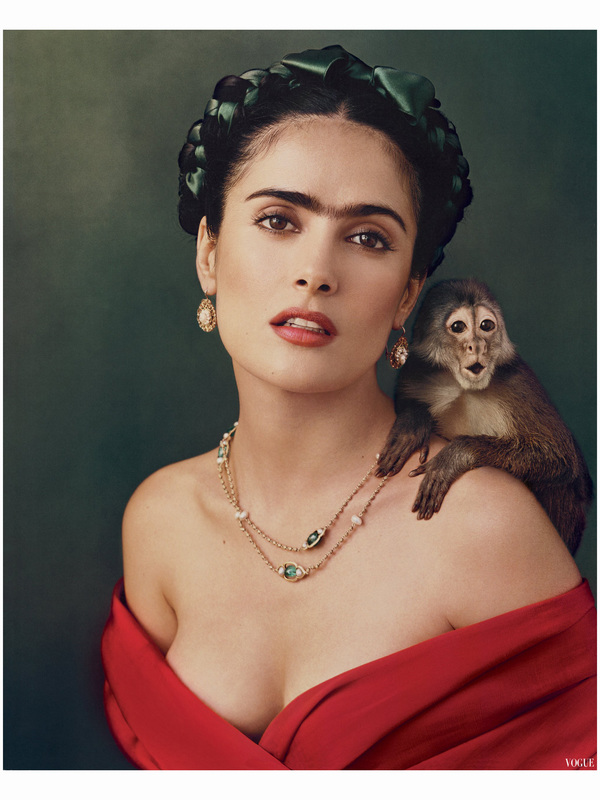
Salma Hayek, Vogue cover 2002
This is a great photograph taken for Vogue magazine. The actress, also being Mexican, reflects the pride and heritage of the rich culture. She played Frida in a biography film. It being published in a famous fashion magazine also makes a bold claim about how the fashion industry has started to question beauty.
|

Frida Kahlo photogrphed by Nicholas Murray, 1939
This is a photograph taken by Nicholas Murray. I realize it is not a painting, but I would still consider it a portrait of her. He has tried to depict her true to her own style of painting. Keeping the traditional wear and accessories that she often wears in her own paintings. His background however, creates a more feminine and softer feel, compared to her own.
|
Gustave Courbet
|
He was a French Realism artist. His art insisted on the physical reality of the objects he observed - even if that reality was plain and blemished. He challenges the traditions and convention of his time and lead the way to Impressionism. He felt that art had become pretentious and therefore sought to depict his subjects emphatically realistic. The Romantic approach which was popular at that time, favored showing deep emotions and individual psychological states.
I like that the expression is not that conventional for this time. It really feels like he is looking to you for the answers, as though you would be able to help with his frustration. The highlights on the skin is simply beautiful and he has maintained great harmony in his tomes and composition. Which is a great contrast to the frustration depicted in his expression. |
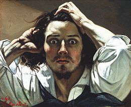
The Desperate Man, Gustave Courbet, 1845
|
Lucian Freud
|
Freud is a British painter and draftsman. He experimented with surrealism, realism and no-romantisism in his work. He describes bodies in his paintings according to shape and structure, often using brush strokes to convey form. His palette was distinctly muted and his choice of composition creates a sense of intimacy.
I am really drawn to the texture and depth that is created by his work. His heavy brush strokes and the depth of how he has built up colour makes the portrait feel personal and creates character. He favored painting relatives and friends and this is possibly why there is such a great emotional connection to the subjects and the way they are portrayed. I like how he is using various tones to convey the colour of the skin. The features of all his subjects are greatly exaggerated in his paintings, and it truly creates a sense of character. It is like he is showing the years, experiences and state of his subjects through the lines and expressions on their faces, further adding to the sense of intimacy you experience when looking at his portraits. |
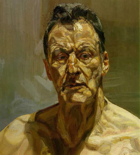
Lucian Freud self portrait, 1985
|
Exercise: Self-portrait
Make a self-portrait of just your head and shoulders. You can choose to work with either natural or artificial light, but natural light is best. Set up your equipment so that you can see yourself and your work surface clearly. Make sure that your face is lit from one side with the other side in shadow. Choose a light, dark or mid-toned fabric background if you can find a way to fasten it behind you.
Your immediate task is to interpret what you see and make a convincing representation of your head, neck and shoulders as a solid form existing in space. Look into the mirror and position yourself so that there’s a good balance in terms of the space surrounding your head.
Your immediate task is to interpret what you see and make a convincing representation of your head, neck and shoulders as a solid form existing in space. Look into the mirror and position yourself so that there’s a good balance in terms of the space surrounding your head.
Sketching
Generally I keep my sketches quite simple, just focusing on shapes and lines. I often see images of other pencil artist who create sketches that are incredibly photo realistic. That isn't something I necessarily aspire to, but I was keen to push myself to make a self portrait sketch with more detail and depth. Of course, I didn't stick to the first rule of sketching which is, don't put to much detail to quick, as I made many mistakes with the proportions of my face! The bottom half is not quite long enough and the eyes are a bit too far apart (something I tried to correct several times)
If I simply view the sketch as someone I don't know, I still like the detail, particularly the texture of the skin. If I view it as a self portrait, then it hasn't quite hit the mark. But this was a good exercise, as I knew I wasn't going to make the same mistake with the painting.
If I simply view the sketch as someone I don't know, I still like the detail, particularly the texture of the skin. If I view it as a self portrait, then it hasn't quite hit the mark. But this was a good exercise, as I knew I wasn't going to make the same mistake with the painting.
Painting
• Is your self-portrait a good likeness? How do you know?
I believe it is a good likeness. The eyes and the hair in particular are very much like my own. I posted it on Facebook and asked people for feedback. Many friends said that they thought it looked just like me. Others commented on how they liked the way I used colours and that the use of blue was interesting to them. There were a few friends that said, though it looks like me, they thought I could have captured my fun-loving energy more, as they felt the image was a bit too sad.
• Which aspects of the face were hardest to tackle?
To be honest, all aspect of painting a face scare me a little. As I mentioned previously, getting the positioning of all the parts right and in the correct proportions was hard when sketching, so I made sure that I really got my outlines sketch right. I always get a bit nervous when doing the nose, lips and eyes. If you don't keep the lines soft and well blended, they can end up looking cartoon-ish, so subtle toes are quite important.
• What technical and practical problems did you experience and how did you overcome them?
No specific problems. I had decided on my colour palette before I began. I created a mid skin tone to be my base colour using Brilliant Red, Rose Brights, Titanium White and Ocre Rouge. Once the base was on, I use mixtures of Sap Green and Ultramarine to create shadows and variations in tone. I mostly use Burnt Umber for the hair, using blue to create highlights. I used Payne's Grey for areas that required darker shadows and around the eyes.
I have also seen many paintings where artists experiment with textured canvas or creating texture with thick paint. I wanted to do this, but without using all my oils on one painting! I used Acrylic Gels and painted them onto the sketch first to create the illusion of thick and textured brush strokes. I thought it was successful and there were quite a few friends who also commented on liking the texture of my final product.
Exercise: Head and shoulder portrait
Decide exactly how your sitter will appear in terms of scale, position, background and light source. What will your sitter wear? For example, what effect would a black jumper have on the impact of the face and the relationship to the background of the picture?
Reflect on the success of your representation and record the sitter's opinion.
Reflection
I chose to do a portrait of my husband. I knew from the start that I wanted to use water colours, as there is just something different to how the paint moves and blends. I certainly didn't want him to be in a traditional pose, as I think the body can create so many interesting shapes and angles.
I first had him sitting in the chair and guided him to making different poses while taking photographs from various angles. This way I can look book at the images to see which of them actually creates the most interesting composition.
When working with water colours it is really important to get the sketch absolutely spot on, as it truly is the foundation of the painting. I made sure that I was happy with proportions and shapes first before I started painting. In contrast to working with oils, you usually work from light to dark. I used a blend of browns and yellow with a lot of water to create the first layer o skin tone. The hardest part can often be leaving the highlights white, as one is always tempted to add paint everywhere. I then just continued building the layers with darker shades of brown to add additional shadows and enhance the three dimensional effect. I used blue for the shirt. Initially I wanted to keep the background blank, but I realized that to add to the atmosphere of the image, a background was needed, which I added loosely and with broad strokes using a much diluted sap green. I used a thin point black marker to finish the details on the eyes.
My husband didn't respond much. He thought his arm looked really big compared to everything else. He was happy that I painted his beard, as I wasn't sure if I wanted to at first. I was scared it would look 'painted on'. He prefers the close up of his face, as he thinks the eyes are the most accurate part.
I personally really like it. I think it is soft and sensual, showing a man who is sensitive and deep, which he is!
Oil Portrait
Even though I really love the watercolour portrait, I wanted to also do a version in oils. I have a close up photograph of my husband that I really adore. It is soft, intense, humble and deep at the same time and I wanted to try and capture that using a similar technique as I did with my self portrait. I used the same palette and applied the Acrylic gel as before, but as this image is softer, I kept the coulour blends softer as well.
Unfortunately I did mess up the placement of the eyes, but as I didn't step back from the painting at the start, I didn't notice it. My initial plan was to create the mood from the photo though, and I think I mostly accomplished that.
My husband really liked the colours and the texture, he thought it made the image interesting and different. Of course he also noticed the eyes were a bit off.
Research Point
Find some portraits that convey a distinctive mood or atmosphere rather than simply a physical likeness. Look at Picasso’s blue paintings with their mood of surreal sadness or the dark earth colours of van Gogh’s early paintings of peasants seated around a fire in their poor, meager surroundings. Look at the strong tonal contrast in Rembrandt’s portraits and the formidably restricted palette with which he seemed to convey the very essence of a person's mood and personality. By
contrast, consider the gaiety or the disturbing, nightmarish quality of the portraits and figure paintings of the Fauve painters and the German Expressionists.
contrast, consider the gaiety or the disturbing, nightmarish quality of the portraits and figure paintings of the Fauve painters and the German Expressionists.
Pablo Picasso - Blue Period

Portrait of Sebastià Junyer i Vidal, 1903.
|

Portrait of Angel Fernández de Soto, 1903
|

The Old Jew, 1903
|
The Blue Period of Picasso is the period between 1900 and 1904, when he painted monochromatic paintings, mostly using shades of blue and blue-green. The Blue Period was greatly inspired when he visited a woman's prison called St. Lazare in Paris. He was also exploring the connection between Christian iconography and the avant garde movement of that time, wit the colour blue symbolizing Mary, the Mother of God. A recurring theme in the portraits is the desolation of social outsiders, whether they be prisoners, beggars, circus people or poor or despairing people in general.
The colour palette, chosen composition and posture of the subjects certainly convey a sense of sadness or despair.
The colour palette, chosen composition and posture of the subjects certainly convey a sense of sadness or despair.
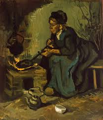
Vincent van Gogh - Peasant Studies

Potato Eaters, 1885
|
Peasant woman cooking by the fireplace, 1885
|
Van Gogh's Peasant Character studies shows his sympathy for the working class. He found them noble and important in the development of modern art. He was inspired by the work of Jean-François Millet who painted peasant figures in picturesque or nostalgic scenes. In Millet's work, individual men and women became heroic and real. He is mostly used dark and somber colours in these depictions. This certainly captures their simple surroundings. I suppose that this is his way of showing that her understands their circumstances, but for me he creates the impression of them being sad, which they aren't necessarily. He himself noted that their simple lifestyle and humble workings of the land appealed to him more than sophisticated society. I therefore, find it odd, that he didn't approach it with a 'happier' palette, unless he was creating an awareness between the wealth gap and rapid industrialization.
Rembrandt Harmenszoon van Rijn

Portrait of Johannes Wtenbogaert, 1633
|

Die Staalmeesters, 1662
|
Rembrandt was well known for his realistic and exceptional ability to capture people in his portraits. He favored the extreme contrast between dark and light. He is most famous for his portraits and 'story telling'. He rendered his people with such realism and drama, that critics often said he favored 'ugliness' instead of beauty.
His portraits were done with grace and fine attention to facial features and expressions. As a viewer you almost feel like you stepped into the room by accident and you are about to witness something you weren't supposed to. He is really good at capturing a moment that feels authentic. The people in his paintings feel warm, as though you can sense the blood pumping in their veins.
His portraits were done with grace and fine attention to facial features and expressions. As a viewer you almost feel like you stepped into the room by accident and you are about to witness something you weren't supposed to. He is really good at capturing a moment that feels authentic. The people in his paintings feel warm, as though you can sense the blood pumping in their veins.
Fauvism
Fauvism was one of the first modern art movements which was inspired by the works of Van Gogh and Seurat. Fauve which means wild beasts, was a collection of like minded French artist lead by Matisse who especially admired the older artist, Gustave Moreau's work in personal expression. One of Fauvism's major contributions to modern art was its radical goal of separating color and allowing it to exist on the canvas as an independent element. Another of Fauvism's central artistic concerns was the overall balance of the composition. The Fauves' simplified forms and saturated colors drew attention to the inherent flatness of the canvas. Above all, Fauvism valued individual expression. The artist's direct experience of his subjects, his emotional response to nature, and his intuition were all more important than academic theory or elevated subject matter. Other artists within this movement were, Albert Marquet, and Georges Rouault.
 Albert Marquet. Sergeant of the Colonial Regiment 1906-7
There is much more emphasis on the outlines of shapes in this portrait. Colours are certainly presented as much sharper and angles are made very obvious. Marquet does still make use of elements to create three dimensional effects though, paying attention particularly to highlights.
He was not afraid to keep a particular colour solid, which again reminds us of how flat the surface is.
As I am viewing the painting I would say that his techniques do make an impact on the mood or atmosphere. The solidness of the black coat almost depicts him as a immovable objects. The hard outlines and shapes of the figure could also elude to his stiffness. In contrast to that, the yellow around him is creating a softness and a sense of movement, almost as though he is in conflict with his surroundings.
|
Rouault's portraits remind me a lot of some of the cartoon-type characters we see today. Features are inflated and strange proportions. The stark black lines that form the features of the face and figure also give is more of a 'cartoon' feel. He has used his colours in a bold and distinguished way. Adding sections of mustard, green or orange into the skin tones to make them stand out.
I'm not sure about atmosphere, but the expression of the Dwarf does evoke a mood to me as the viewer. It appears as though he has had a complicated life. There is a sense of 'wear and tear' on his skin and clothes. the is distance and sadness in his eyes and you cannot help but feel sorry for him. I am sure that the Fauvist movement created a lot of waves when it first began, as it often makes the viewer fell uncomfortable and unsure about the art. Contrasted to the work of Rembrandt and Picasso above, which is elegant, soft and has a real sense of movement, these work can often feel stagnant and strange. What I can most appreciate about this movement, is that it challenged artist to look at a subject differently. That it is not only about what we see, but how we interpret it. |

Georges Rouault, The Dwarf, 1937
|
German Expressionists
Expressionism was inspired most heavily by a movement in symbolism during the late nineteenth-century art. Artists were reacting agains Impressionism and Academing Art. Vincent van Gogh, Edvard Munch, and James Ensor proved particularly influential to the Expressionists, encouraging the distortion of form and the use of strong colors to convey a variety of anxieties and yearnings. There were a particular group of German architect who desired to become painters and started a group of like-minded painters called Die Brücke. It included, Ernst Ludwig Kirchner, Fritz Bleyl, Karl Schmidt-Rottluff, and Erich Heckel from Dresden. There was also a group formed in Munich, called Der Blaue Reiter with Franz Marc, Paul Klee, and August Macke and Wassily Kandinsky.

Avec Barbe Allemande, 1920, Paul-Klee
|

Malers Heckel Portrait, 1907, Erich Heckel
|

Lady in a Green Jacket, 1913, August Macke
|
As with the Fauvist movement, we again see colours being celebrated and used to convey feeling mood or atmosphere. These artists used distorted forms and jarring, unnatural pigments to elicit the viewer's emotional response. Teir paintings started transending realism and delving more into abstraction.
I am quite drawn to the work of Heckel. His obvious use of strokes and bold colours evokes you as the viewer and similarly to pointillism, makes you question how we see colours.
I am quite drawn to the work of Heckel. His obvious use of strokes and bold colours evokes you as the viewer and similarly to pointillism, makes you question how we see colours.
Exercise: Creating mood and atmosphere
For this exercise you can choose to paint a full figure portrait, a head and shoulders portrait or a self-portrait. Your finished portrait should be unusual or expressive in some way. It can be true to life or not, depending on the effects you wish to achieve. You may be more concerned with conveying an air of menace or mystery, for instance, than with creating an
accurate likeness. Decide what you’re trying to achieve at the outset and make some notes in your learning log. Come back to this when you’ve finished your painting and assess the extent to which you’ve achieved your objectives. While you arrange your subject, think about the colour palette you’ll use – whether you’ll work with local colour, low key, monochrome or strongly contrasted tones or misty subtle effects. The decisions you make will depend on your expressive intentions.
Planning
As mentioned before, I'm quite drawn to the effect that watercolours can have when doing portraits. I have experimented before with bleeding and running colours. It creates a great deal of drama and flow, hich in itself evokes a mood in the person viewing the art.
I new I wanted to use a female profile, but as I didn't have a sitter and had painted more than enough images of myself, I just went through some of my magazines till I found a profile image that I liked. For the type of painting I had in mind, it didn't matter if I was working from a photograph.
Once again the sketch was most important. When sketching the image onto the canvas, I changed the angling and proportions slightly to my initial drawing, as this would make the placement of the colours easier.
I started with a mild mix of blue to put down the first areas of shadows and outlines. I then started adding more intese shades of blue in areas where there are more intense shadows and allowed it to flow down. I used Viloet to create the running around the eyes. Laying it on with a lot of water, so I could blow it into various directions. I then painted the lips and the dress and thought it would be a good compliment if they matched. The hair was painted last while the canvas was standing upright, allowing the paint to run on its own. I finally finished the eyes with a black marker and using a white acrylic paint to add the highlighted spots in the center.
For me the fluidity created by the paint makes the subject appear soft and feminine. I feel like it also implies that there is an energy and underlying strength in the woman. Naturally a viewer would also see the dripping as tears, so for most it would feel like the woman has a sadness. This could be the case, as we all carry a bit of sadness. I guess a lot of the atmosphere or mood could still be open to interpretation by the viewer. But the words that were in my head, were feminine, strong, and somber.
Exercise: Conveying character
This study could be a portrait or self-portrait. Whichever you choose, the aim is to convey character through facial expression. Most faces seen in repose look sad; the facial muscles relax into lines that can appear stern or forbidding. On the other hand, it’s hard for a sitter to sustain a smile so one way to tackle this exercise might be to work from a photograph that captures a fleeting expression. Choose your sitter then decide what aspect of your character you want to convey –
gentleness, grumpiness, moodiness, humour, etc. Think about how you can convey this with your painting. You don’t have to paint someone you know; you could choose to paint a television personality, for example, but you’ll still need to decide in advance what aspect of
gentleness, grumpiness, moodiness, humour, etc. Think about how you can convey this with your painting. You don’t have to paint someone you know; you could choose to paint a television personality, for example, but you’ll still need to decide in advance what aspect of
Rationale
As you may already have noticed, I am captivated by the female form. There are so many layers and levels to a woman that it is almost impossible to capture all of them. For me the most prevalent feature of a woman has always been the incredible strength she carries within while still remaining soft and sensual on the outside. I wanted to paint a figure that could show this sensuality but that would hopefully also show underlying strength. I knew I wanted to keep to a simple palette as that would add to the atmosphere of sensuality.
I used a photograph as my reference, but also remembered my previous sketches and observations to add additional details that would make the image more realistic. I mostly worked with Burnt Umber, White and Yellow Ocre. I used Liquin to dilute the Burnt Umber and make different washes, as I new that adding white into the Brown would make it loose it's transparency.
I believe that you can feel her strength in her body most, while the expression on the face is one of mystery and sensuality.
Review
When you’ve completed this exercise, review all your portraits and consider which ones are the most successful. What technical demands did you encounter? How hard did you find the interpretive element of portrait painting?
There is a lot more pressure when painting someone you know, or yourself, as you want it to be accurate. I guess the biggest challenge is to realize that art doesn't always have to be accurate, just an interpretation. With every piece I completed I broke down more boundaries of what is expected. Experimenting with different techniques and ideas.
I quite like the Figure I did with the painting knife. there is a freedom and looseness to the lines that make them intriguing. I enjoyed experimenting with the Acrylic Gels and would certainly use these again. I also like the sensuality of the female in the swimsuit. There is an intensity in her stare and I love the warmth of the colours together.
The most important thing I learned is it to continuously step back from the canvas and observe, in order to get proportions, angles and lines correct. View the subject as an interpretation and remember that you as the artist can control details. And, it may be easier to paint subjects you don't know, as you then avoid the stress of not getting the likeness correctly!
Exercise: A figure in an interior
How will you locate your figure in the space? How can you suggest depth? Think about the relative size of objects, and the lines of walls, tables, window ledges and doorframes. These lines will help to define space and give your picture a greater sense of pictorial space and depth (perspective) so think how best to exploit them. Choose your eye level carefully. Decide whether you're going to work sitting down or standing up. If you're working sitting or standing at your easel you’ll have very different views of the figure. Decide which suits your purpose best. A figure in an interior is very complex and challenging to paint so don’t be afraid to simplify.
As I was the figure on the bed, I had to take a photo of the angle and composition that I wanted. Once I was happy with the positioning I started to paint. I wanted to make the contrast between dark and light much more apparent in the objects, so I went for a stark contrast with the cloth and the skin.
I am happy with the depiction of perspective and I made the decision to change the colours from the original room which was also good. Many of the paintings I saw of people in interiors had a soft earthy palette, so I wanted to do that as well. but of course, I couldn't avoid the 'drama' and decided to add back a pop of colour using Light Red. This also creates a nice compliment to the yellow.
I do wish that I had left out the two objects that are in the corner, as they feel unnecessary.
Research point
Look at some paintings of figures in interiors from different periods and choose two or three pictures that particularly appeal to you. (You’ve already looked at some seventeenth-century Dutch examples in Part Two.) At least one of these should be
from the twentieth or twenty-first century. Consider what you think the artists’ intentions are and look at the technical and creative solutions that they’ve brought to the subject.
from the twentieth or twenty-first century. Consider what you think the artists’ intentions are and look at the technical and creative solutions that they’ve brought to the subject.
Ramon Lombarte
Ramon Lombarte was born in Spain in 1956 and devoted his life to painting in 1976. Lombartes works can be found in many museums and known private collections in Europe, the United States and Asia.

|

|

|
I am completely mesmerized by his works, in fact he is the first artist who inspired me to pursue painting. He manages to capture moments in daily life with a combination of ease, flawlessness, mystery sensuality. All words I would be extatic for people to use when describing my art.
As the viewer you can't help but be sucked into the frozen moments he has created. But is is not that time is standing still, but rather that moment has become infinite. There is a calm beauty to his images with an underlying energy. He invites us to come out of the daily routine and from his artist soul he raises us up from a conventional surrounding world.
He uses a laborious method of lithography to produce his work, using high quality stones and a French printing press and hand painting each piece. Unfortunately, there isn't much more information on his painting techniques.
Jan van Eyck
 Portrait of a Giovanni Arnolfini and his wife, 1434, Jan Van Eyck
One can't really do research on figures in an interior and not include The Portrait of Giovanni Amolfini and his wife by Jan Van Eyck. It was one of the most complex and revolutionary paintings of its time. Van Eyck mad use of iconography, geometric orthogonal perspective (the relation of two lines at right angles to one another),and expansion of the picture space with the use of a mirror.
Van Eyck painted by applying layer after layer of thin translucent glazes to give the painting intensity in both tone and colour. This glow in colour helps you to feel the lush and richness of the fabrics in the space and on the couple. Working with oils he was able to blend colours by painting wet-in-wet to achieve subtle variations in light and shade to heighten the illusion of three-dimensional forms. He paid close attention to finer details, particularly the textures of fabric.
He has also played with light to continue his creation of depth and space in the room. The light spills in from the window and is reflected off of surfaces in a vibrant and elegant manner.
Exercise: Telling a story

Create a simple narrative, involving one or several human figures, and produce a painting that gives the viewer the clearest possible idea of what’s happening. Use all of the resources of colour, tone, shape and line to create a painting that goes beyond the merely figurative to convey a simple narrative. Choose a story from your own life or work or a new idea.
In April we went to China with friends and one of the cities we visited was Xian. There is a part of the city which they call the Muslim Quarter, which is a bee hive of people (literally!) buying food. In one of the alley way my friend snapped this amazing shot of Grandma and Grandpa looking after their grandchild. It was a real moment of serenity in between all the madness.
I was really drawn to the expressions on their faces and knew that watercolour would be the best way to capture this. I only worked with black paint and markers of different thicknesses.
Getting the sketch right was the most important. I spent more than two hours creating my sketch as the foundation.
Assignment three
In this assignment you’ll be showing how your skills in handling paint and interpreting your subject are developing.
Explore some of the endless possibilities for arrangements in portraiture by looking at the work of other artists. Visit galleries, look online or in books. How important is the background or interior depicted? How important are the colours and the handling of paint and brushwork in the paintings you’ve studied? Make notes in your learning log, concentrating on works that you find especially arresting or admirable.
Explore some of the endless possibilities for arrangements in portraiture by looking at the work of other artists. Visit galleries, look online or in books. How important is the background or interior depicted? How important are the colours and the handling of paint and brushwork in the paintings you’ve studied? Make notes in your learning log, concentrating on works that you find especially arresting or admirable.
Planning and Research
It was quite difficult for me to decide on what I wanted to paint. there are so many great paintings out there of figures and faces. I really wanted to be true to my own style, but then also push myself to create something using ideas or techniques that I have been practicing or reading about. To start with I chose to do a couples of sketches of potential images that I may like to work with. I first thought about showing a figure in the rain an created the outlines of a scene (shown below left). Looking at the image I was not sold on it really celebrating human form. Next I sketched a female who also happened to be standing in the storm and facing it (middle below). I liked the power and atmosphere created by the image, however, I still struggled seeing it as a painting. As much of my work thus far have featured many females, I also wanted to sketch a male figure, to see whether or not that inspired me. though I am very drawn to the shadows and shapes created by this image, I did not feel a connection to it.

|

|

|
 A3 Charcoal sketch using dark brown, tan and black.
A lot of the pieces I produced during this unit are self portraits. For some reason I feel more relaxed painting or sketching myself as I don't necessarily feel the pressure of having to get everything right. A friend also mentioned to me that there is a clear connection to work I do of myself and looking back at my work, I could see that this was true.
Like any woman who has many insecurities and body issues, there is something different about painting or drawing your own body. You look at yourself with different eyes. Not noticing flaws or 'bumps', but instead seeing shapes, lines, movement and strength, helping me to create images that are provoking, sensual and connected.
I used the camera and the mirror to play with angles. Once I found a composition that I thought was promising, I sketched it using charcoal (left), as I wanted the sense of colour to help me envision it as a potential painting. Once I completed the sketch I felt a definite emotional connection.
As mentioned in some of my research above, Ramon Lombarte was one of the first artists who inspired me to paint and who sparked my intrigue to the female form. The sensual figures in the warm light is sertainly something I would like to do. He, however, work with a great sense of realism, particularly in his sue of colour. I knew I wanted to create a similar atmosphere to his works through my composition and use of light, but I wanted to explore working with colour in a more expressionist way. I discovered the atrist, Ewa Kienko Gawlik. I wasn't able to find too much information about her, other than she was born in Poland in 1965 and is interested in painting, photography and architecture.
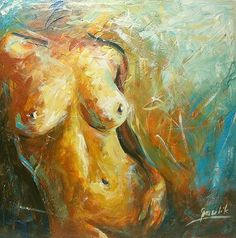
|

|

|
What really drew me to her images were the balance of warm and cool colours and how they created a wonderful balance. I wanted to make use of the idea of working with a limited palette of blue red and yellow.
Steps:
1. I first created a charcoal sketch on my canvas and regularly stepped back to check my proportions and angles. When creating the sketch for the painting, I decided to make the eyes bigger than they were in the practice sketch, as I wanted them to be more visible.
2. I painted in the background first. Using a blend of Light Red, Raw Siena, Crimson and Linseed oil. I applied it thickly with a medium flat brush making sure to leave deliberate strokes.
3. I used the same combination of colours fot the first layer in the figure, but that was mixed with more Raw Siena. To fill in the areas of the figure and block out the shadows I simply used my finger tips.
4. After waiting for my first layer to dry, I applid the next layer of shadowing using Phato Blue. T be perfectly honest, I was quite happy with the painting by this point and could easily have filled in the eyes and been done, but I decided I still wanted that contrast of light and shadow to be more apparent.
5. I then started filling my figure. Mostly blending combinations of Phato Blue, Raw Siena, and Light Red and mixing white to create the different tones in the flesh.
6. To add the final highlights that would really create the 'warm glow' I was looking for I used lime green.
7. the final touch was adding the brow and lashes, which I did with Payne's Grey. I felt that black would take away from the warmth I had created.
Reflection:
I am satisfied with what I accomplished. I feel that there is an atmosphere and mood created on the canvas. Of course this will be subjective to each viewer. For me though, I feel like there is a sense of mystery in the subject. The lines of the body are sensual and provocative, as is the use of colour. I also like the play on light and the angles where it hits the body.
I feel like I do still struggle with the proportions and placement of facial features, so this is something I will need to continue to practice.
Reflection on Tutor Report
I really enjoyed the work that I did during this unit, as I am fascinated with the human form. I felt that I was pushing boundaries and trying out many different techniques. The tutor did respond positively to some of these, though she felt that I overworked my paintings or did not know when a piece was completed. Again, some of the feedback was quite harsh and left me somewhat deflated. After some time though, I was able to look at the feedback critically and will endeavour to work on my application of paint, building on techniques that are my strength and being more conscious of when to continue and when to stop.
